继第一家店的成功之后,Chee-se Hoa Thanh继续对西宁市的广大青年,特别是家庭掀起大浪。不仅带来韩国美食的有趣体验,特别是比萨饼-炸鸡和甜甜圈,而且Cheese还雄心勃勃地给这里的人们介绍一个享受独特和无与伦比的产品的空间。由于这些原因,Ksoul Studio继续陪伴着Chee-se,参与了这个商店的室内设计之旅。
Following the success of the first store, Chee-se Hoa Thanh continues to be a big wave to Tay Ninh youth in general, and families in particular. Not only bringing interesting experiences in Korean cuisine, especially with pizza – fried chicken and doughnuts, but Cheese also has the ambition to introduce to the people here a space to enjoy unique and incomparable products. For those reasons, Ksoul Studio continues to accompany Chee-se, participating in this store interior design journey.
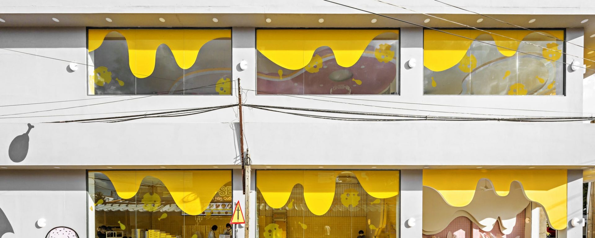
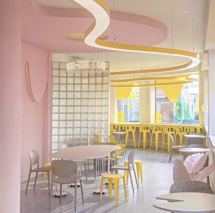
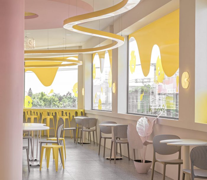
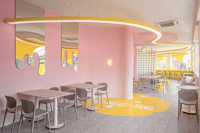
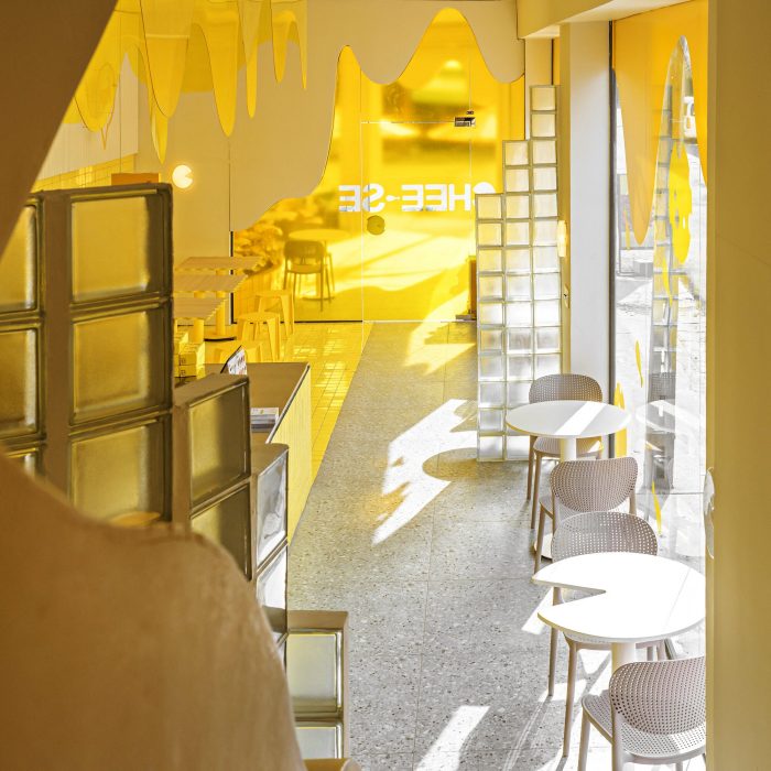
受品牌形象中融化的奶酪层的启发,加上黄色和灰色这两种主要颜色,Ksoul调整了一个非常特别的美学图片,有一个新的空间和许多令人惊讶的情感层。Ksoul用浅灰色和黄色弯曲的线条覆盖了整个外墙,在创造一个立方体效果和一个多层次的多维空间时,非常精致。在这个地方,不仅有曲线的语言,还有粉色墙壁的分隔,创造出一种友好的感觉,对于Ksoul为这个项目选择的设计风格来说,是极其突出的。
Inspired by layers of melted cheese in the brand identity, with two main colors of yellow and gray, Ksoul has adapted a very special aesthetics picture with a new space and many layers of surprising emotions. Covering the entire faCade in light gray with yellow curving lines, Ksoul has been extremely delicate when creating a cubic effect, and a multi-dimensional space with many layers. Throughout this place, there is not only the language of curves, but also the separation of pastel-colored walls, creating a sense of friendliness, and extremely prominent for the design style that Ksoul has chosen for this project.
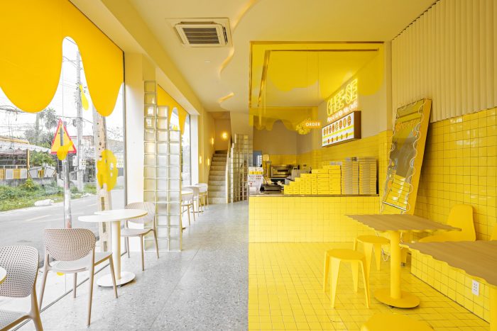
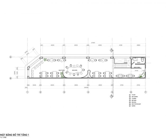
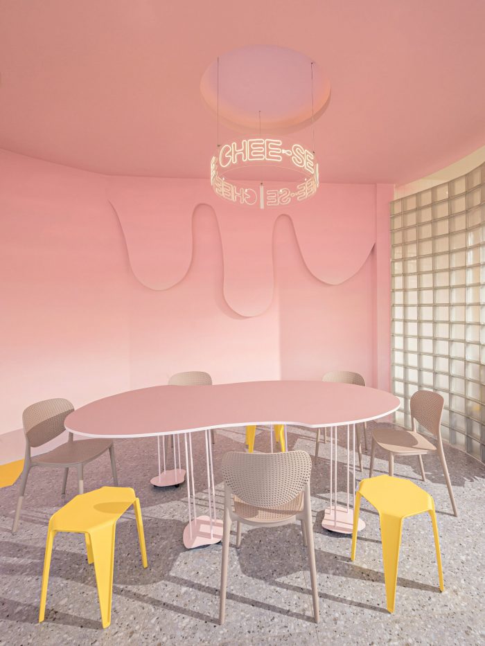
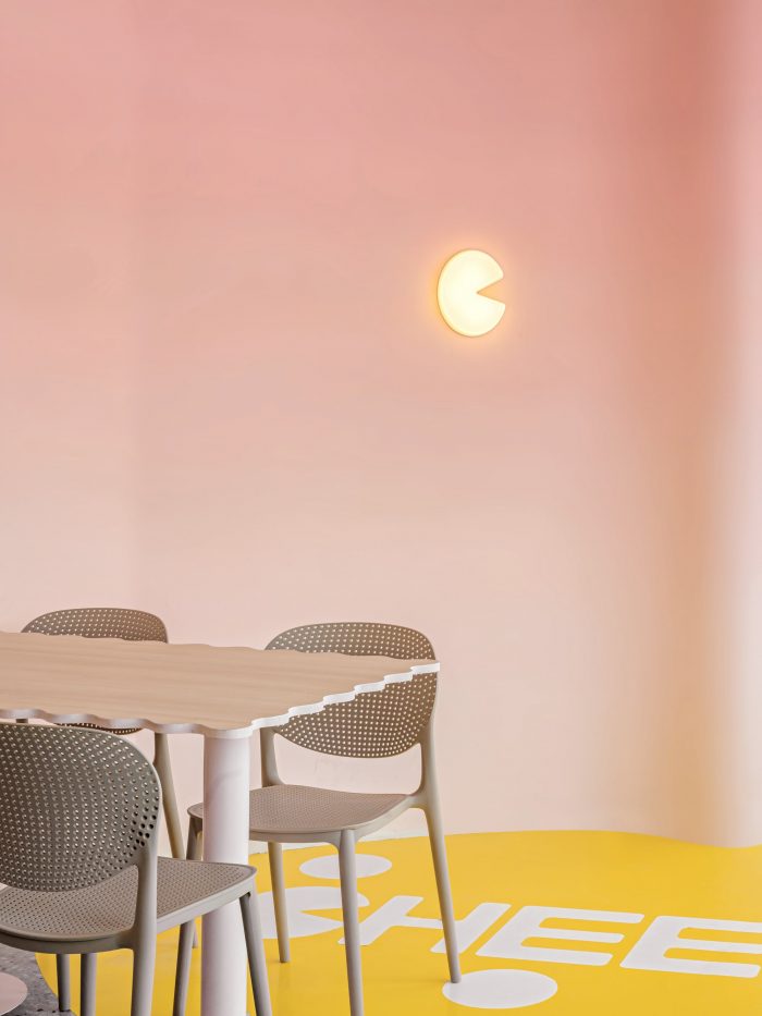
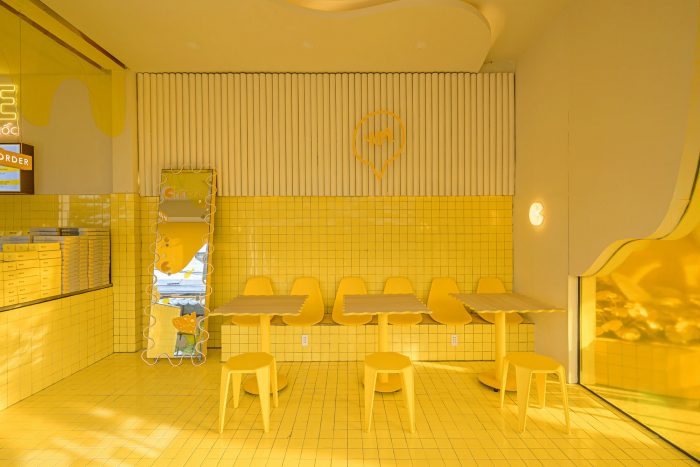
在美学必须与功能并行的政策下,店内的每一个小细节都很容易让人认识到它们被选择和投入使用的原因。受拼图启发的单人边桌已经充分显示出它们的潜力,可以成为大型聚会的长桌。吧台和收银台被整齐地设计成长方形,肯定没有比不锈钢更完美的表面选择了,与光亮的搪瓷砖相结合,带来一种和谐感和餐饮店所需的清洁感。一楼的空间被漆成黄色和灰色。
With the policy that aesthetics must go along with function, every little detail in the store is easily recognized why they were chosen and put into use. Single side tables inspired by jigsaw puzzles have shown their full potential to become long tables for big parties. The bar and the cashier are designed neatly and squarely in the shape of a rectangle, and surely there would be no more perfect choice for the surface than stainless steel, combined with glossy enamel tiles to bring a sense of harmony and the clean feeling required for an F&B store. The ground floor space is painted in yellow and gray.
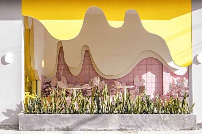
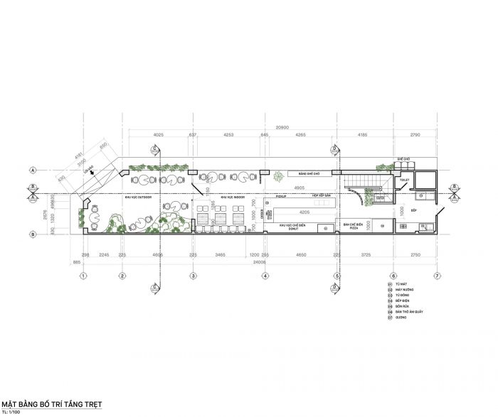
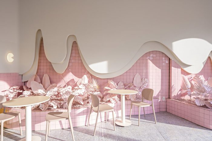
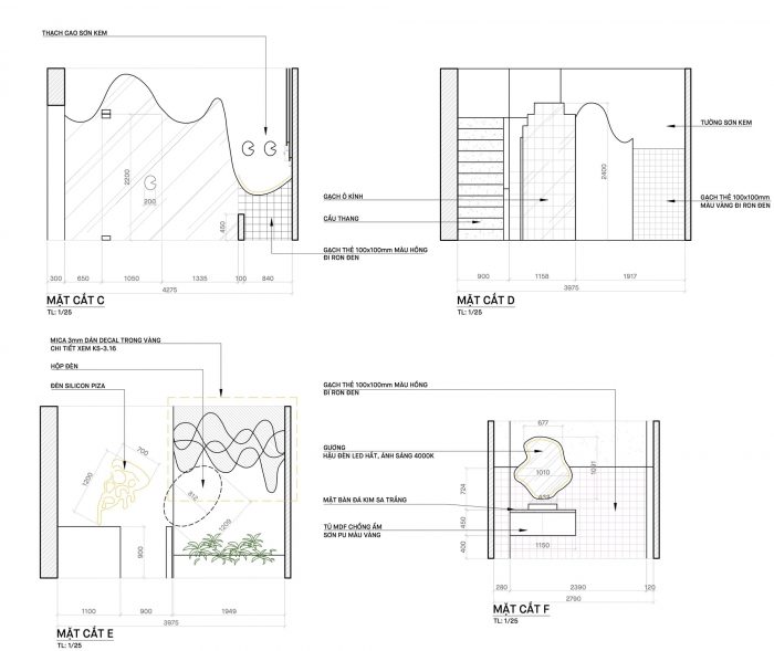
走近一楼,你会惊讶于另一种非常令人印象深刻的颜色–粉红色,在弯曲的墙面上涂有混色效果。颜色和材料的有趣组合,如玻璃砖或天花板上的长效硅胶灯,以及覆盖在统一颜色上的精致的装饰性植物阵列,在整个设计中创造了一种协调的效果。而最特别的是单人桌、团体桌和外卖区的划分布局;这也促成了Ksoul非常注重客人体验的舒适性和隐私性。
Approaching the first floor, you will be surprised with another very impressive color – pastel pink painted with an ombre effect on the curved wall surface. The interesting combination of colors and materials, such as the glass tiles or the long-lasting silicone lights on the ceiling, and the delicate array of ornamental plants covered in uniform colors create a coherent effect throughout the whole design. And the most special feature is the layout of the division of single tables, group tables, and take-away areas; which also contributes to the fact that Ksoul pays great attention to comfort and privacy for the guest’s experience.
回顾与Ksoul合作过的连锁店,我们非常感谢客户的信任。得益于此,我们更懂得培养技巧和创意,在操作和使用过程中,不仅要给顾客带来更多的审美图画,还要做到实用。
Looking back at the store chains that Ksoul has cooperated with, we are extremely grateful for the trust from our customers. Thanks to that, we understand more about cultivating skills and creativity to not only bring customers more aesthetic drawings but also be practical in the process of operation and use.
Architects: KSOUL Studio
Area : 245 m²
Year : 2022
Photographs :Valor Studio
Manufacturers : An Cuong, Dulux, Kohler, EUROTO, Vitto
Lead Architect : Huynh The Nguyen
Engineering : Ksoul Studio
Clients : Chee-se
City : Tây Ninh
Country : Vietnam

