
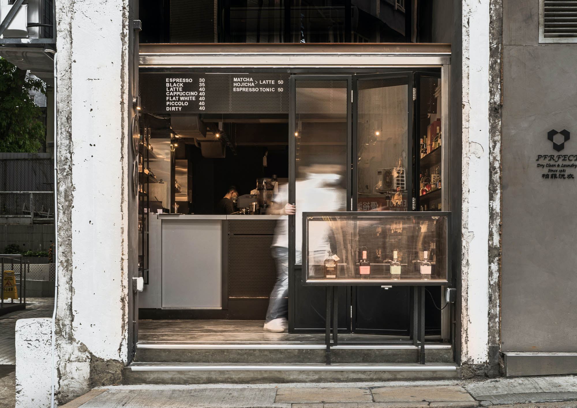
Dio位于九如坊社区一栋60年代建筑的拐角处,白天提供手工茶,晚上则提供精心策划的葡萄酒和烈酒。设计大纲要求提供一个以零售为主导的空间,同时具有咖啡馆和酒吧的功能。外墙和内部的附加结构被剥离到原始状态,很有特色地揭示了拆除后留下的伤痕。外墙故意没有完工,拥抱不完美,体现了商业占用的短暂性。
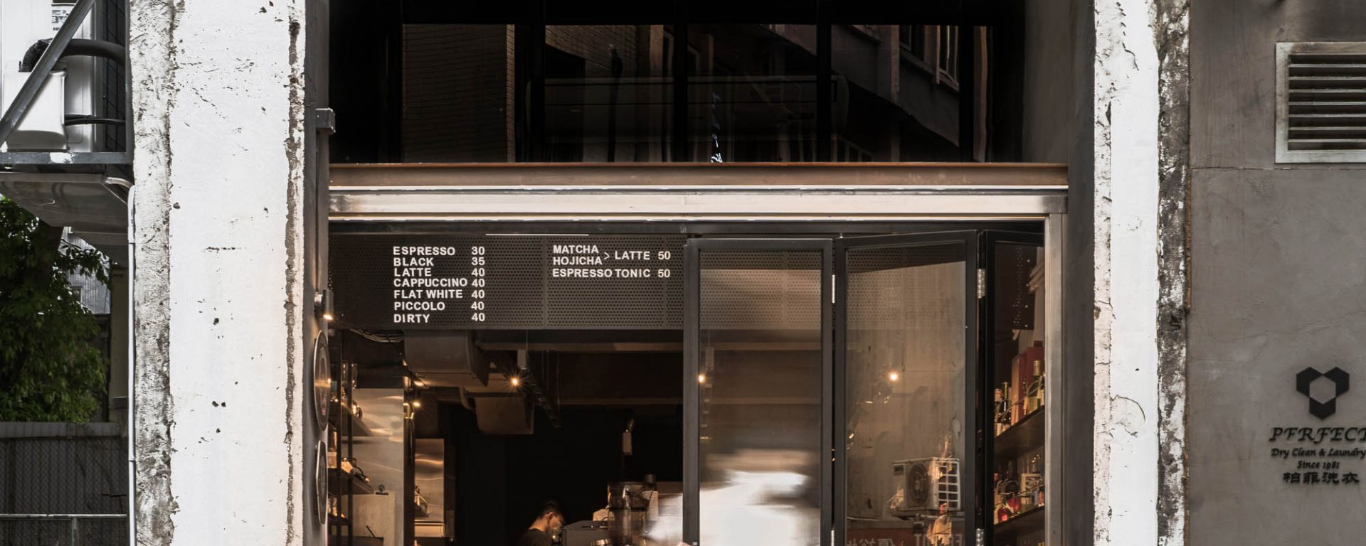
Located at the corner of a 60s building in the Kau U Fong neighbourhood, Dio offers artisan cuppa by day and curated wine and spirits at night. The design brief asked for a retail-driven space with coinciding functions of a cafe and a bar. The add-on structure on the facade and interior was stripped down to its original state, characteristically revealing the scars left behind from the demolition. The facade was left unfinished on purpose, embracing the imperfection and manifests the transience nature of the commercial occupancy.
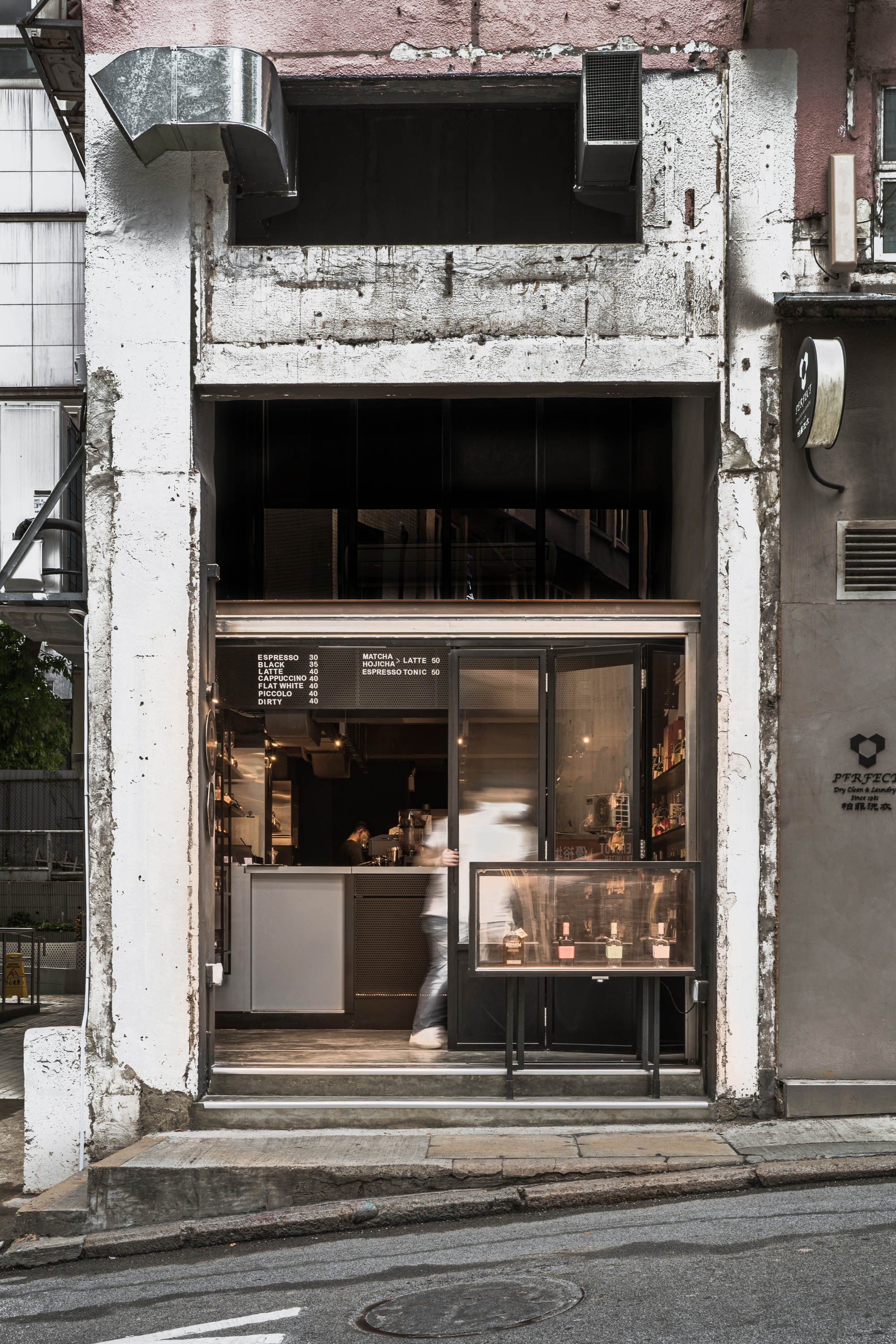


不完美的白墙被建筑的粉色涂料和隔壁的灰色饰面框住了。我们在品牌标志的设计中采用了这两种颜色,作为对其存在时的环境的一种致敬。坐落在一条狭窄的斜坡街道上,新的店面是一个后退区,以便为路人提供一个缓冲区,让他们在这里逗留,并对Dio在头顶的菜单上提供的东西感到好奇。
The imperfect white wall was framed by the building’s pink paint and the grey finish next door. We employed these two colours in the design of the brandmark as a tribute to the context at the time of its existence. Situated on a narrow sloping street, the new shopfront was a setback to allow a buffer for passersby to linger and be curious about what Dio offers on the overhead menu.

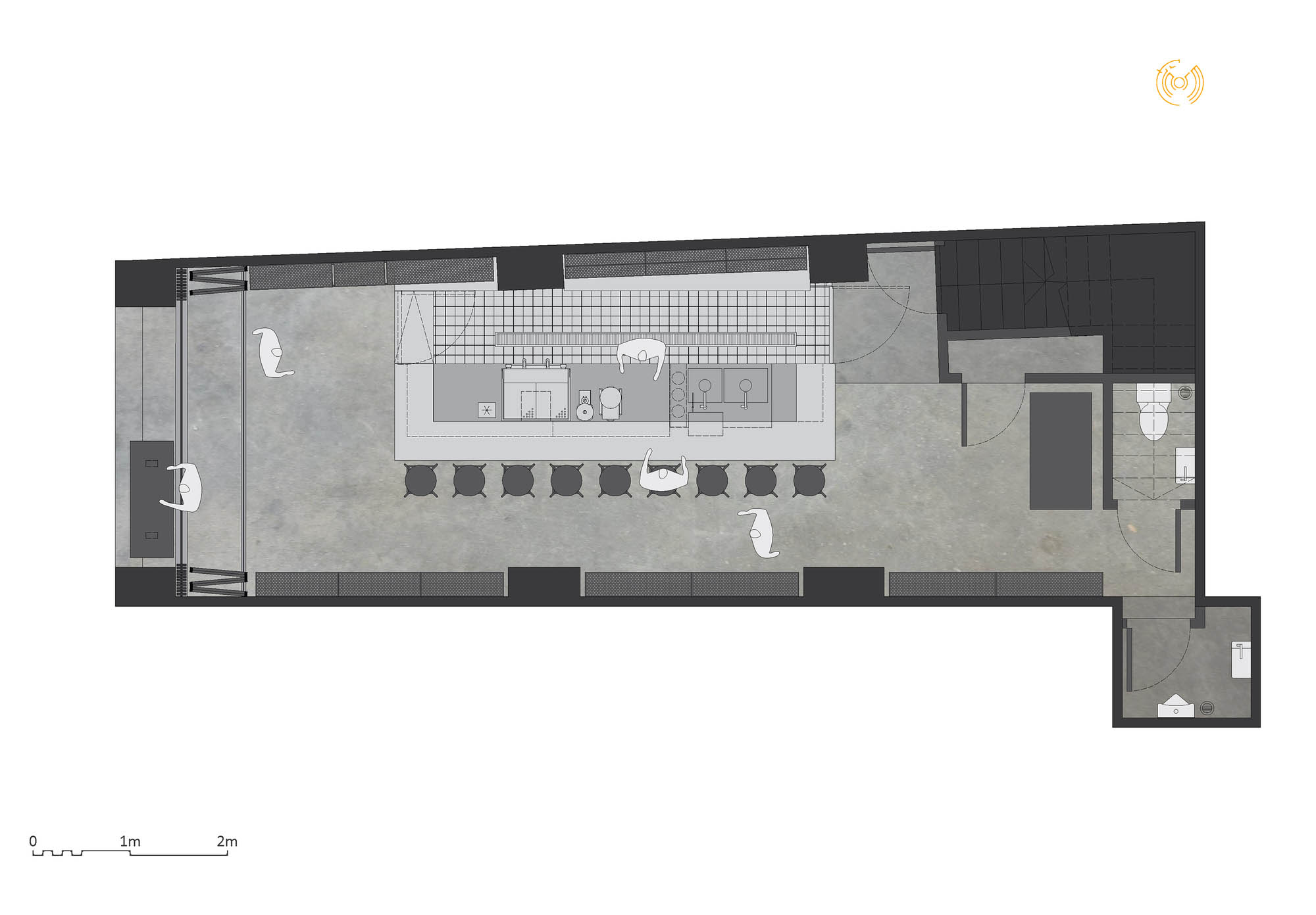

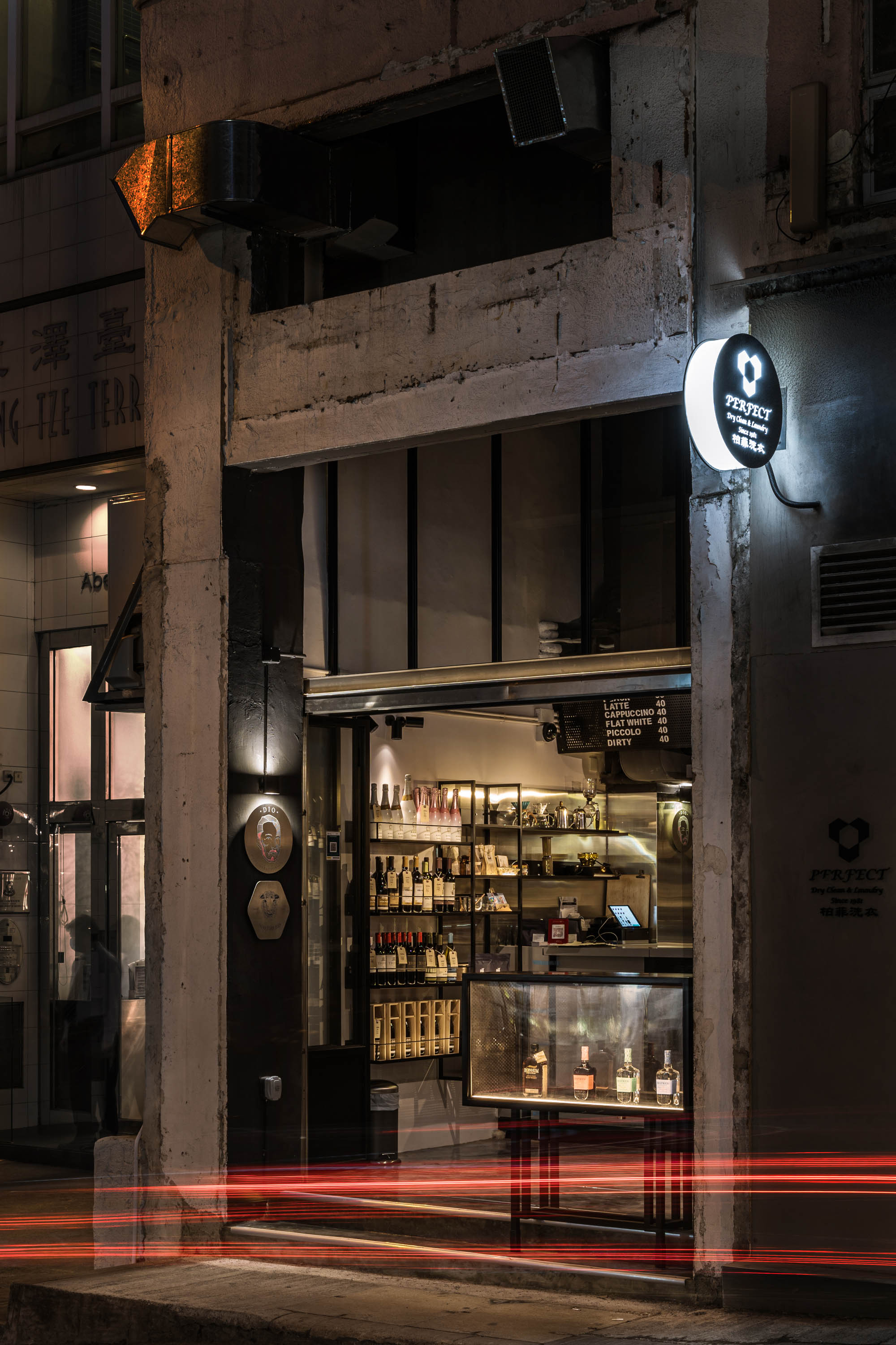
后退区让顾客在喝饮料的同时,也能停留下来与城市互动。我们建造了一个宣传展示台/高桌,面对着时髦的高夫街的入口,这是一个受到大多数摄影师和博主欢迎的风景如画的地方。店面的玻璃门可以完全打开,作为街道的延伸接待附近的食客和购物者。室内表面是一系列有策略的色调的灰色,作为产品、顾客和方案的容器发挥作用。每种色调的灰色都执行其特定的任务。
The setback zone lets customers stay and interact with the city while having a drink. We built a promotional display stand / high table that faces the entrance of the hip Gough Street, a picturesque spot welcomed by most photographers and bloggers. The shopfront glass doors can be completely opened up as an extension of the street receiving diners and shoppers nearby. The interior surfaces are a series of strategically toned greys that function as the container of the products, customers, and the programmes. Each shade of grey performs its specific tasks.
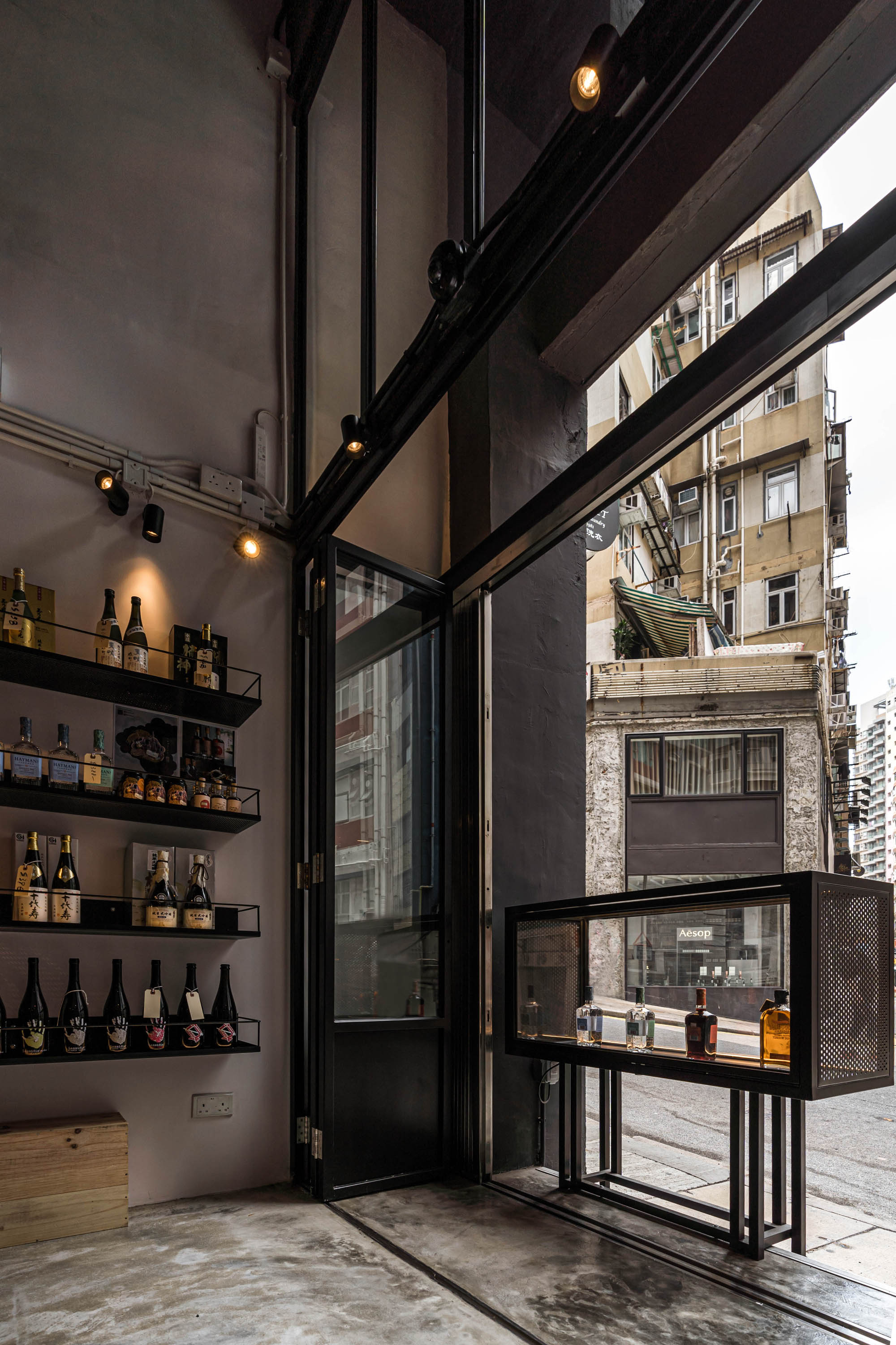
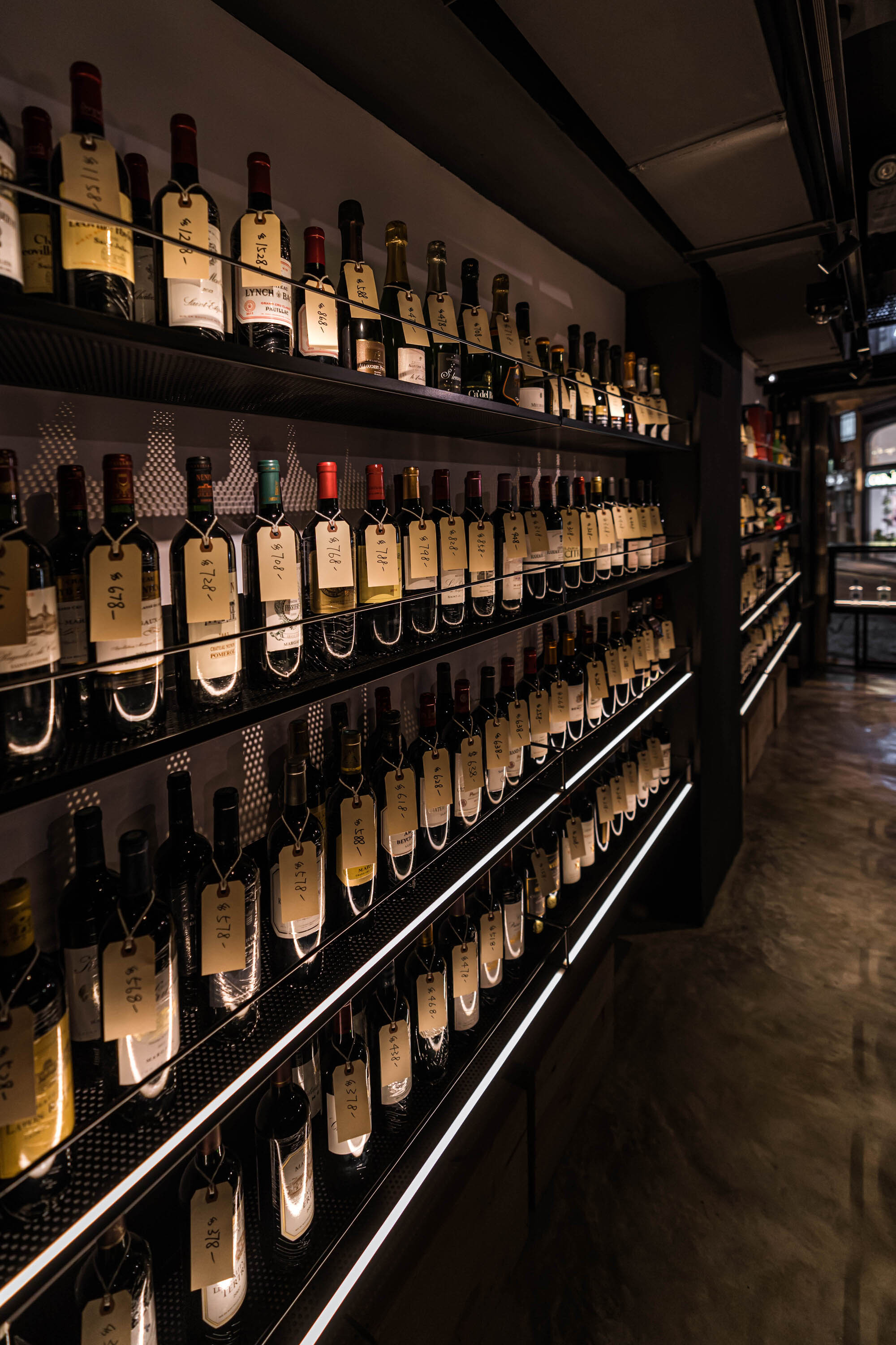
墙壁和吧台的浅灰色带来了酒瓶和饮料,而深色的则消退和消失。货架上的LED灯带将人们的注意力吸引到商店的最末端。它的散射光照亮了产品,并通过面板投射出复杂而微妙的影子。我们使用了磁性轨道来实现灵活性。附在轨道上的磁性防眩光筒灯和射灯的组合可以随时重新安排。这是为商店经营者专门设计的,可以在需要时随时插拔。因此,空间始终保持对人的柔韧度。
The lighter greys in the walls and bar counter bring forward the wine bottles and served beverages, while the darker ones subside and disappear. The LED strips on the shelves draw attention to the very end of the shop. Its diffused light illuminates products and casts intricate yet subtle shadows through the panels. We used magnetic tracks to allow flexibility. The combination of magnetic anti-glare downlights and spotlights attached to the tracks can be rearranged anytime. This is designed specifically for the store operators to plug and unplug whenever needed. Hence space always remains pliable to the people.


建筑师 : Finorm Studio
面积 : 440 平方英尺
年份 : 2021年
照片 : Anson Ho
制造商 : Fórmica
首席设计师 : Max Chan
品牌设计 : Burton Li
城市 : 香港
国家 : 中国
Architects: Finorm Studio
Area: 440 ft²
Year: 2021
Photographs: Anson Ho
Manufacturers: Fórmica
Lead Designer:Max Chan
Branding Design:Burton Li
City:Hong Kong
Country:China