
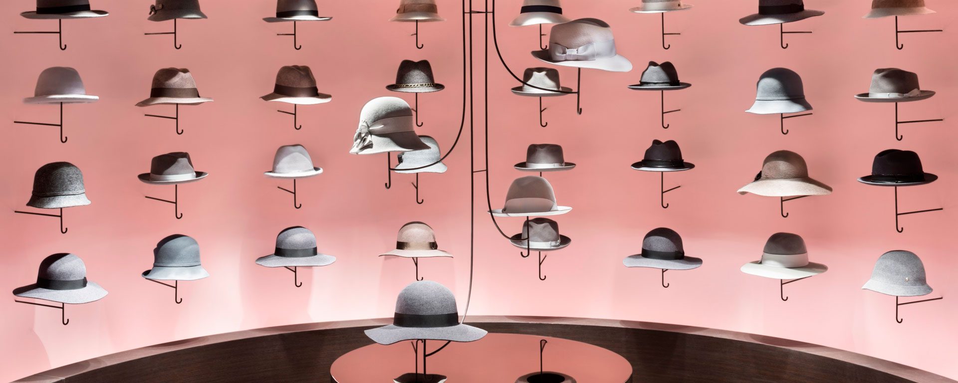
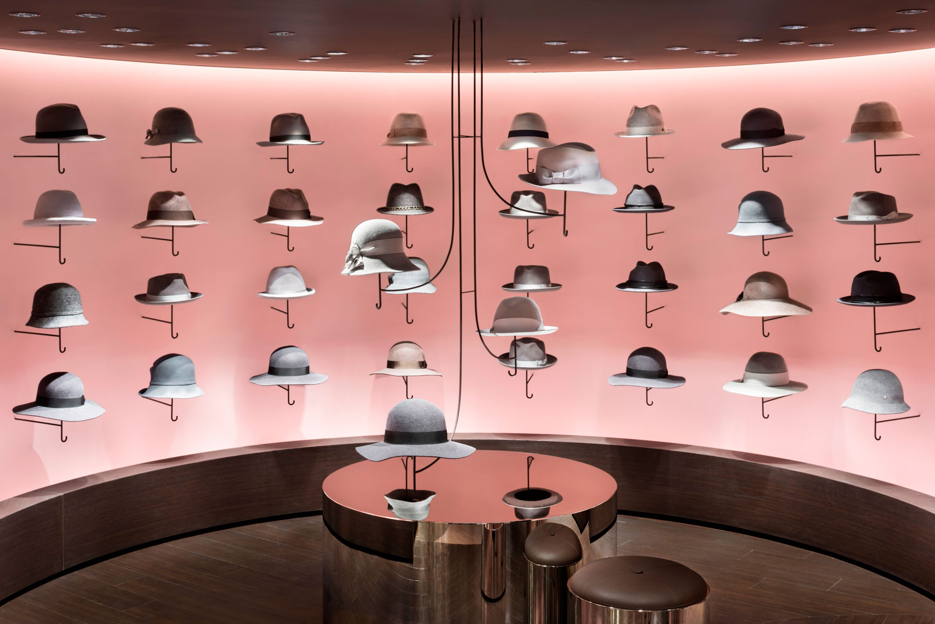
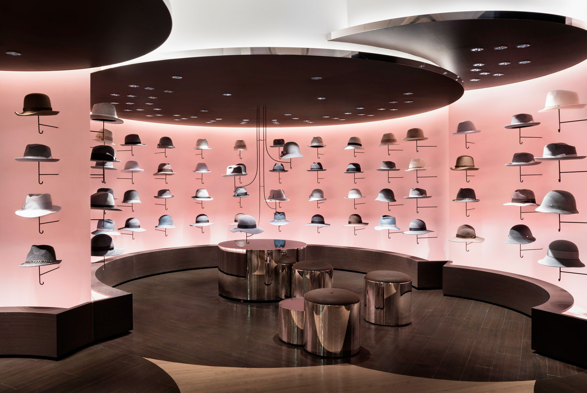
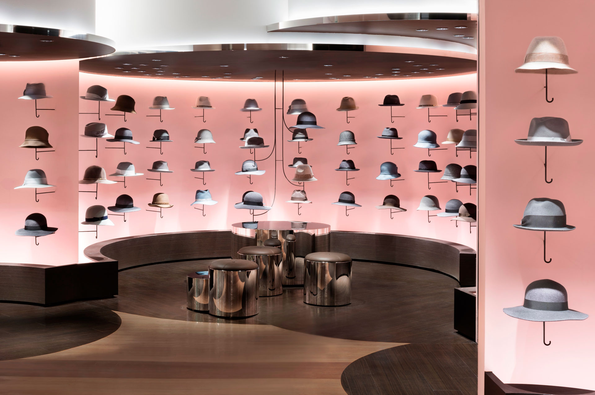
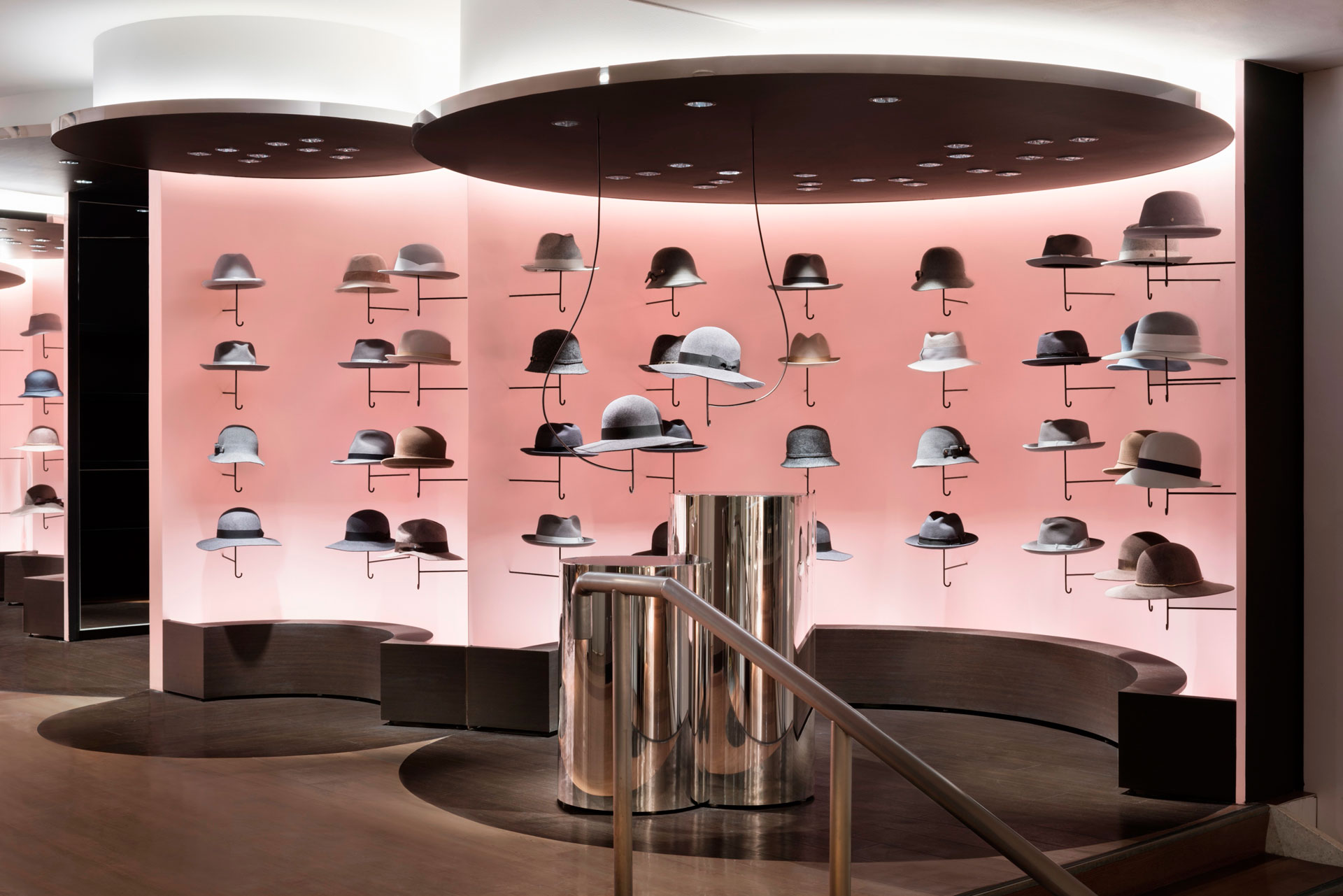
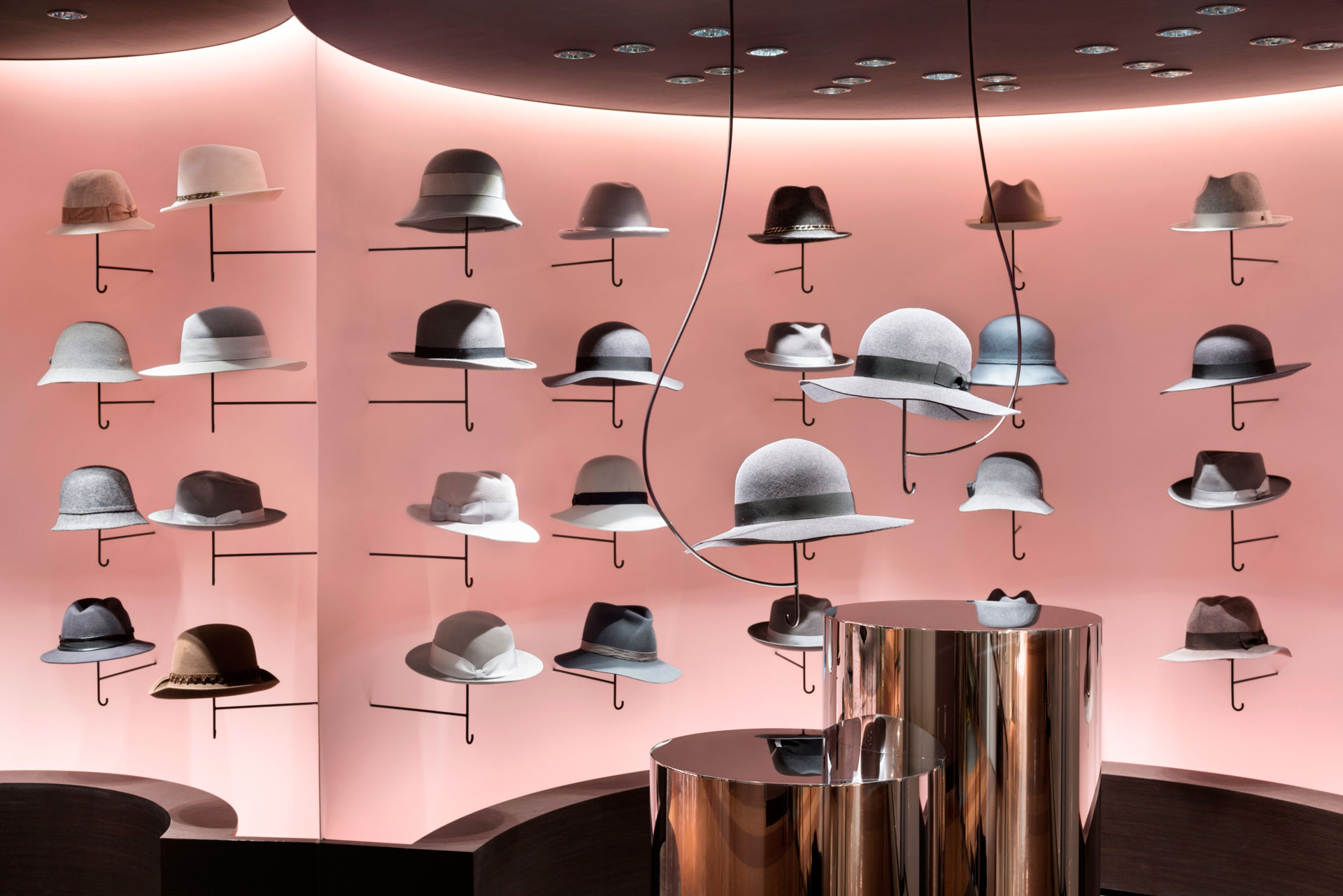
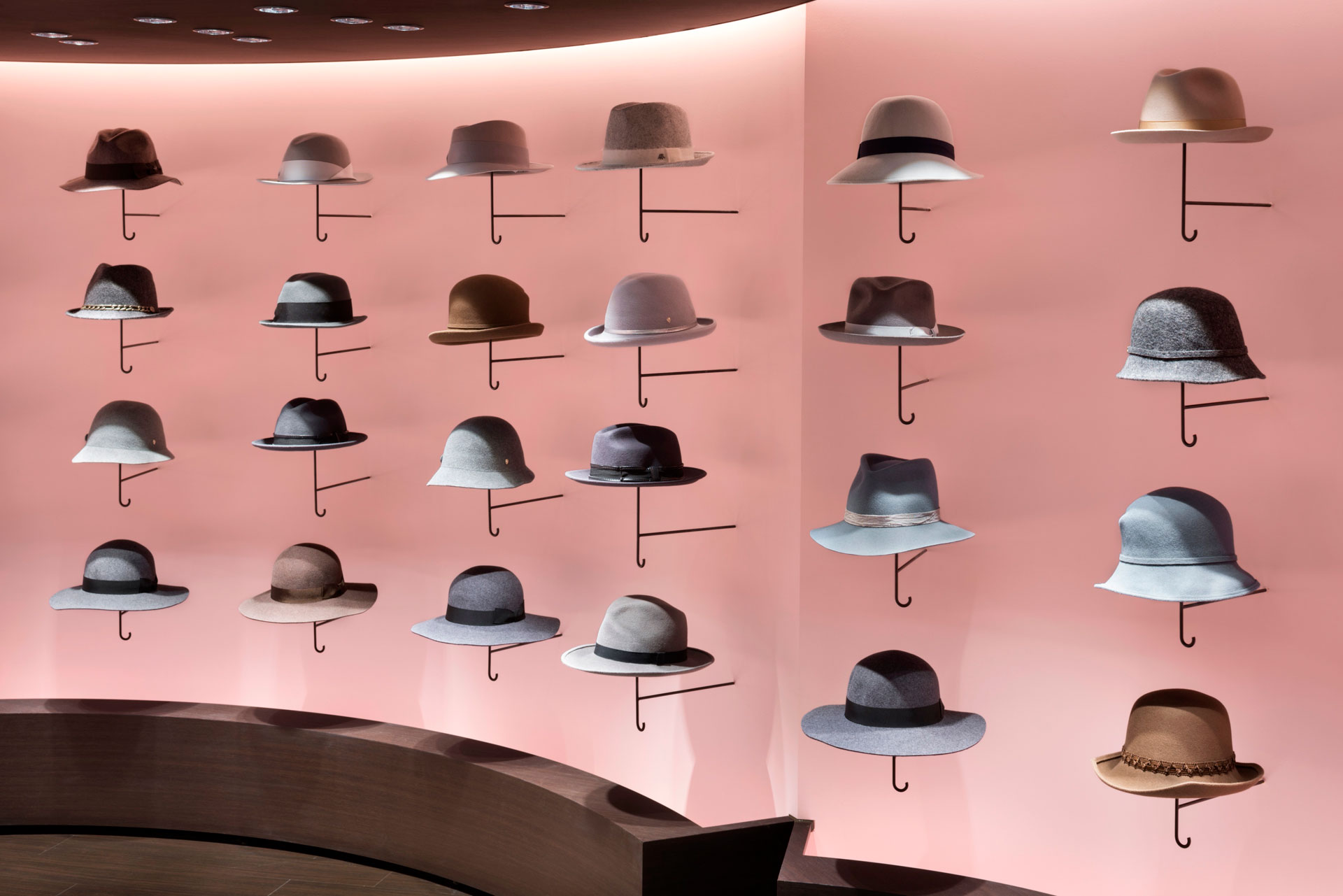
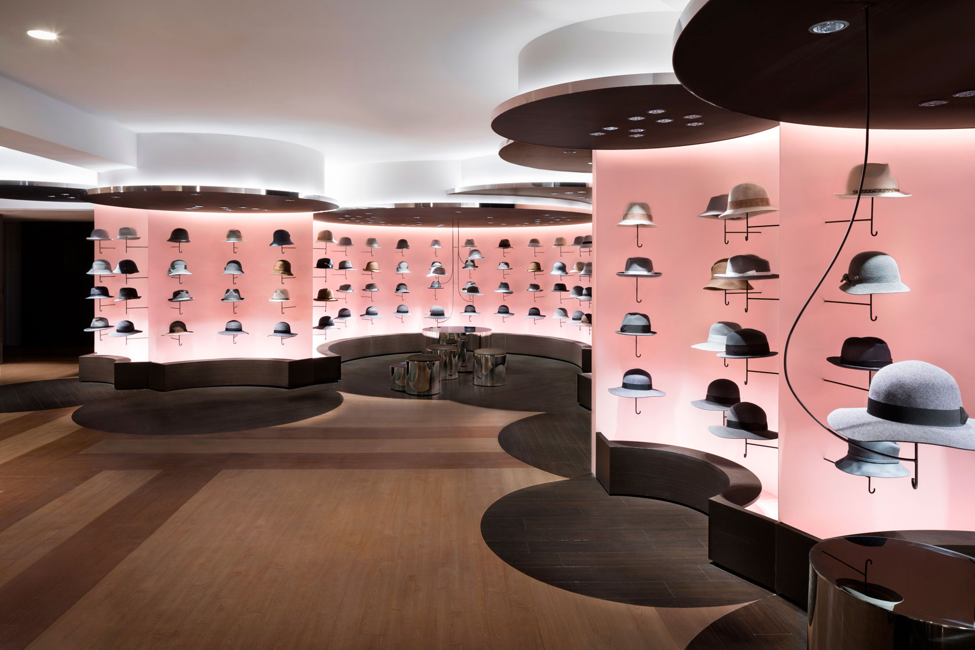
西武涩谷百货公司二楼的女帽店设计改造。商店位于一个稍微隐蔽的区域,几根横梁从天花板的一个部分伸出来。为了利用这种环境,圆柱形结构被不规则地放置,创造出被巨大的“云”包围的感觉。
这样一来,空间不均匀表面的约束就不那么明显了。事实上,它允许空间与周围环境的充分变化,并把商店变成一个受欢迎的三维空间。天花板的高度根据每个圆柱体的不同而变化,这样就不会引起人们对梁的注意。与整个店铺巨大的“云”形象形成对比的是,每一顶帽子都像小“伞”一样摆放着。
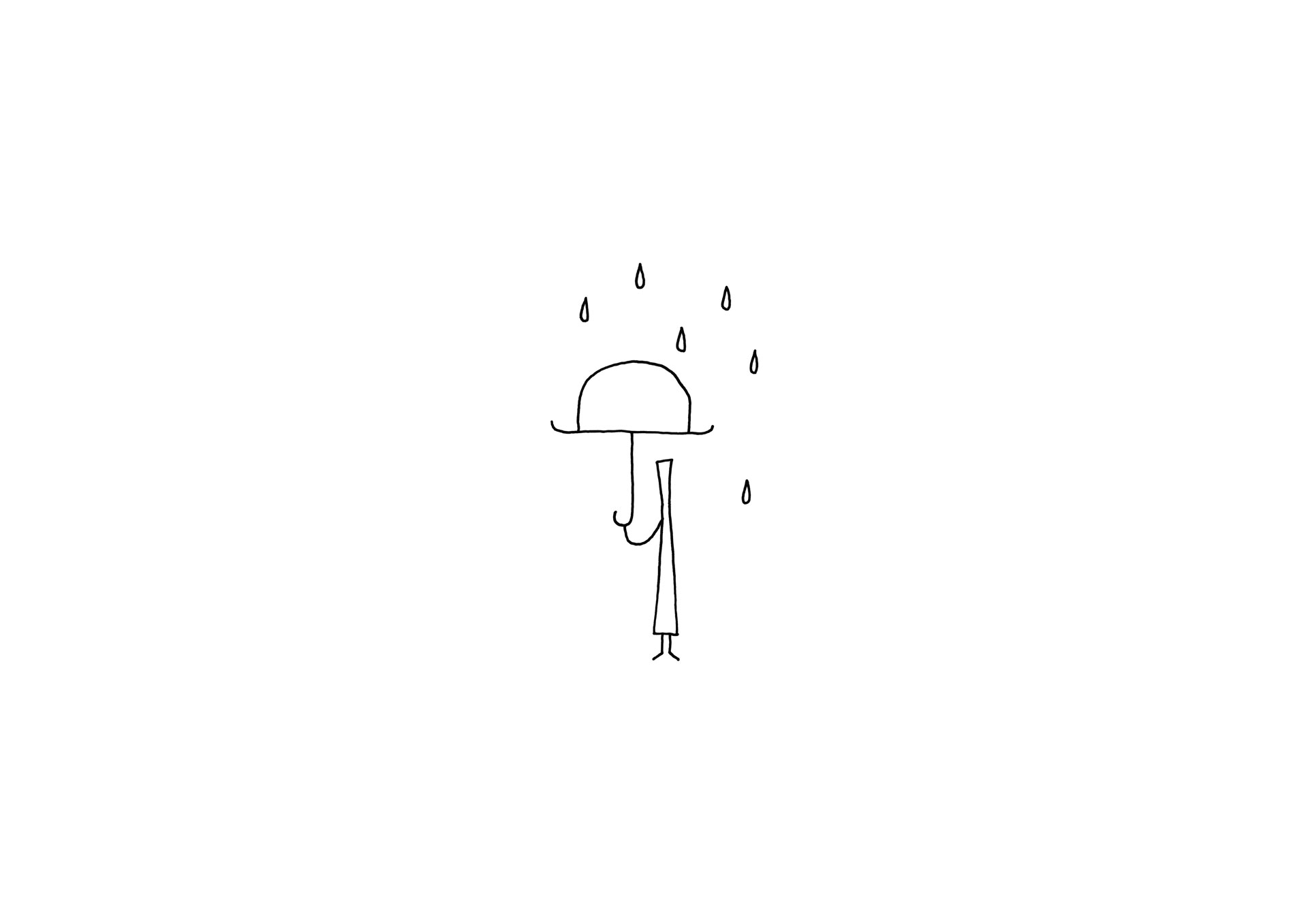
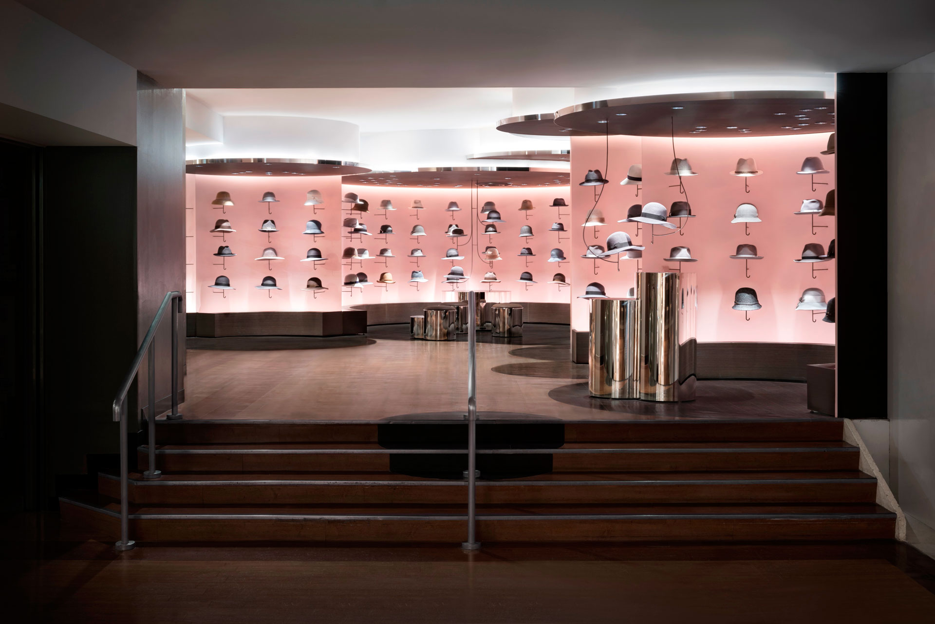
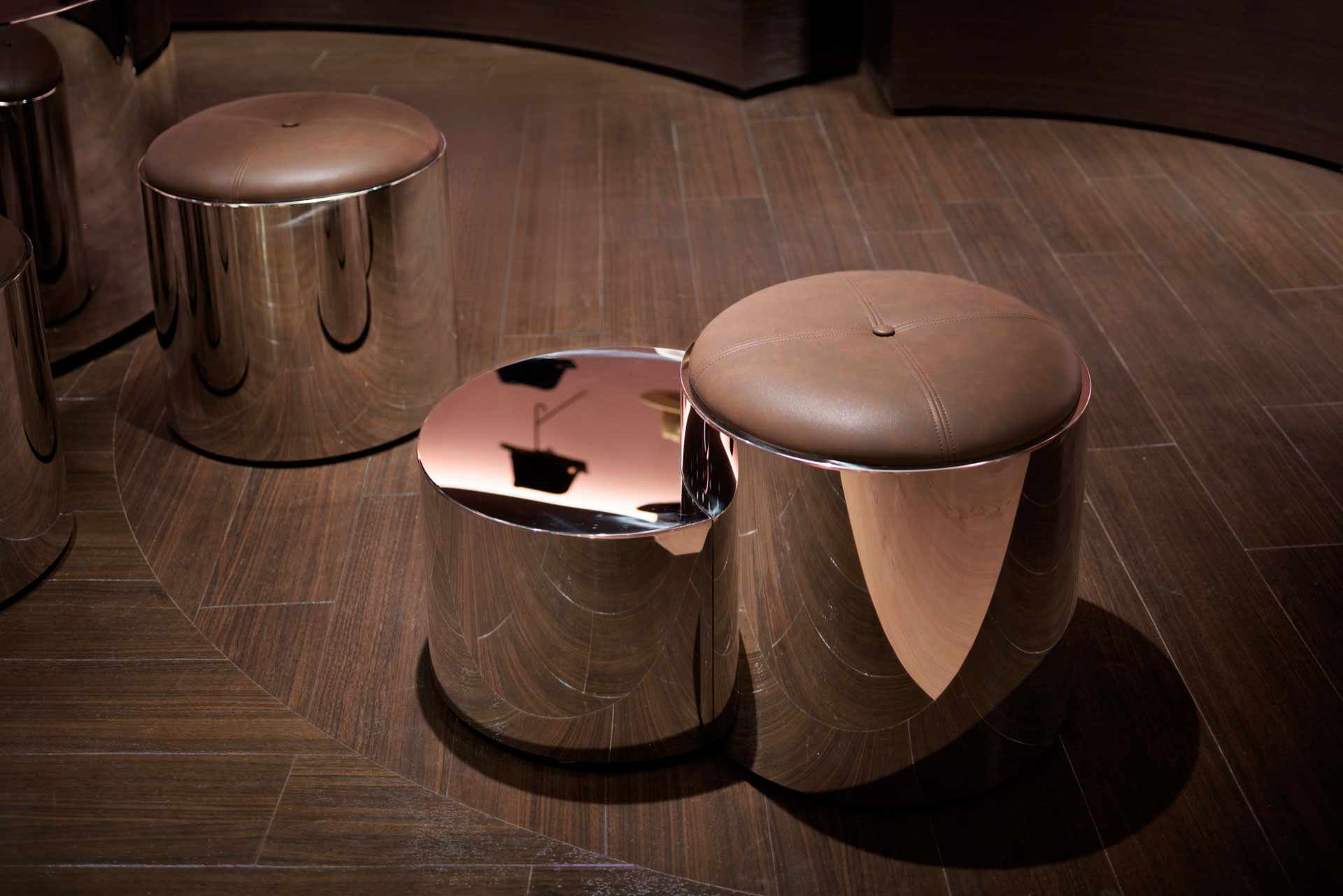
以前帽子店的商品都是放在架子上展示的,这家店也是如此,但这次帽子是新装在悬臂上的,像一把从墙上伸出来的伞柄。由于帽子有助于避免阳光照射,保护头部,所以没有与雨伞形象格格不入的感觉。空间的中间部分变成了一个座位区,有镜面装饰的凳子和桌子,管道从天花板上垂下来,帽子随机地挂在上面,就像一把漂浮的“雨伞”。此外,与周围使用保守色彩设计的商店形成对比的是,墙壁以粉红色和棕色完成,木材被用来营造温暖的氛围。
A design renovation for a women’s hat store on the second floor of the Seibu Shibuya department store. The store is located in a slightly secluded area, and several beams are protruding from one section of the ceiling. In order to utilize this environment, cylindrical structures are irregularly positioned so as to create the sensation of being enveloped in huge “clouds”.
In doing so, the constraints of the uneven surfaces of the space became less noticeable. In fact it allowed the adequate variation of the space with the immediate surroundings, and turned the store into a welcoming three dimensional space. The ceiling heights are varied according to each cylinder, so as not to draw the attention to the beam. In contrast to the overall store bearing the image of huge “clouds”, the individual hats were displayed like small “umbrellas”.
Previously the goods in a hat store are displayed on shelves, and thus was the case with this store, however this time the hats were newly mounted on arms resembling a handle of an umbrella projecting from the wall. Since hats help avoid the sunlight and protects the head, there is no out of place feeling with the image of an umbrella. The middle section of the space was turned into a seating area with mirror finish stools and tables, pipes hanging down from the ceiling with hats randomly hooked on like a floating “umbrella”. Additionally, in contrast to the surrounding stores that are designed using conservative colours, the walls were finished in pink and brown hues and wood was used to conjure a warm ambience.

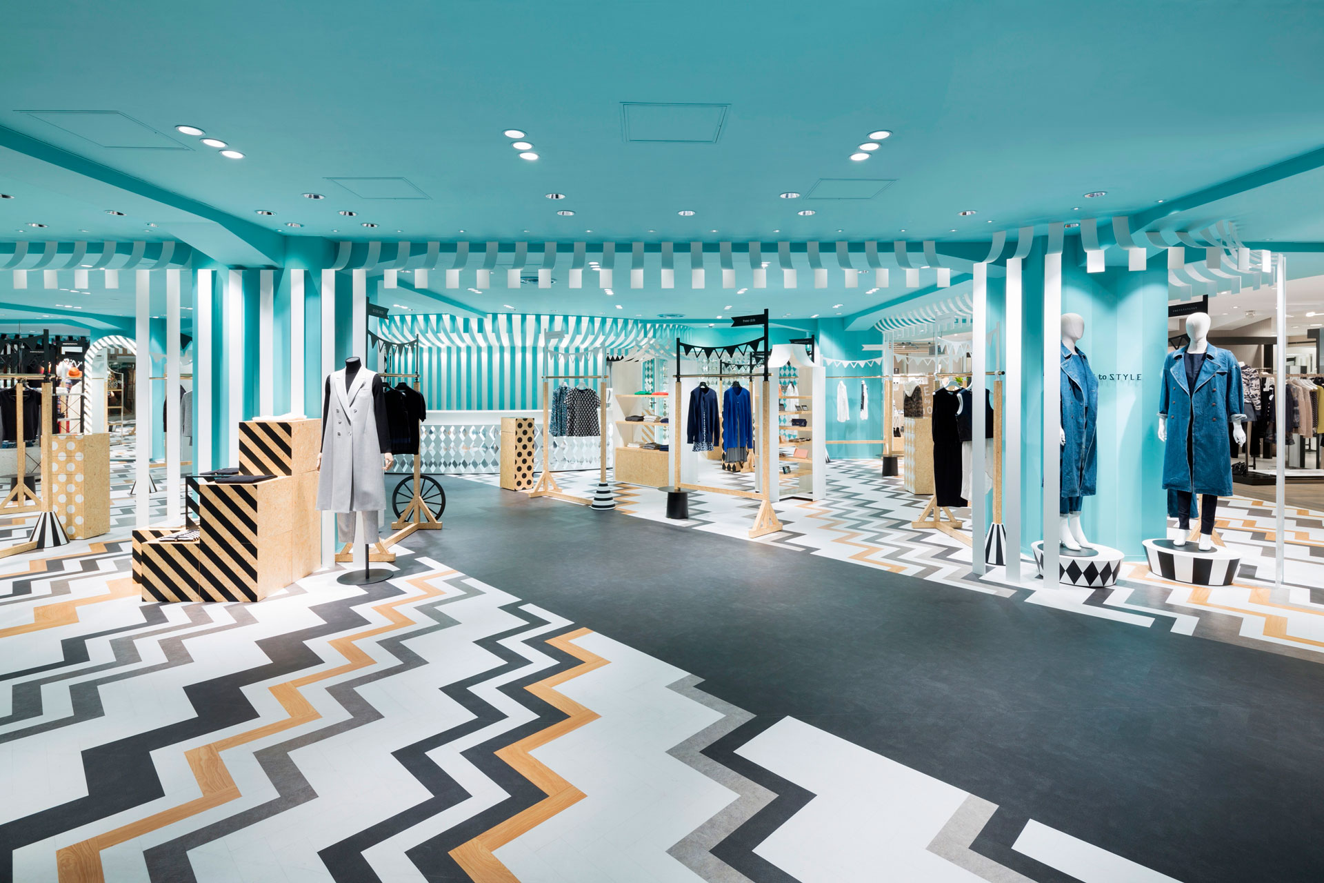
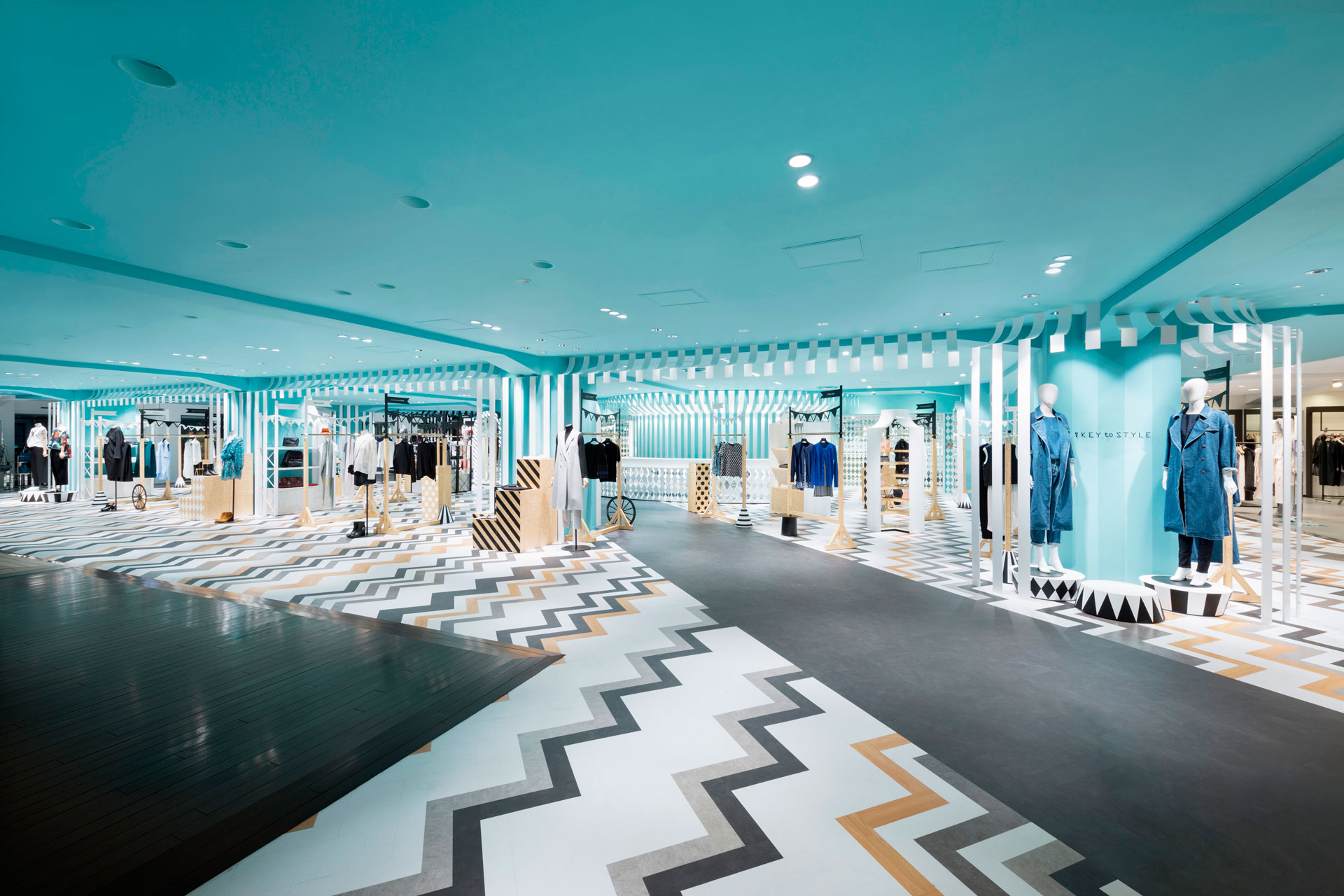
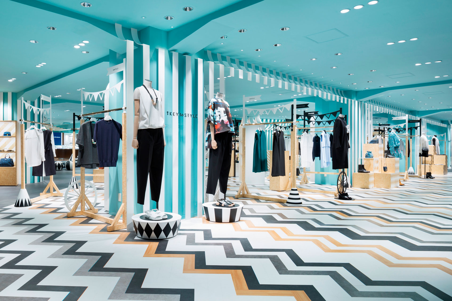
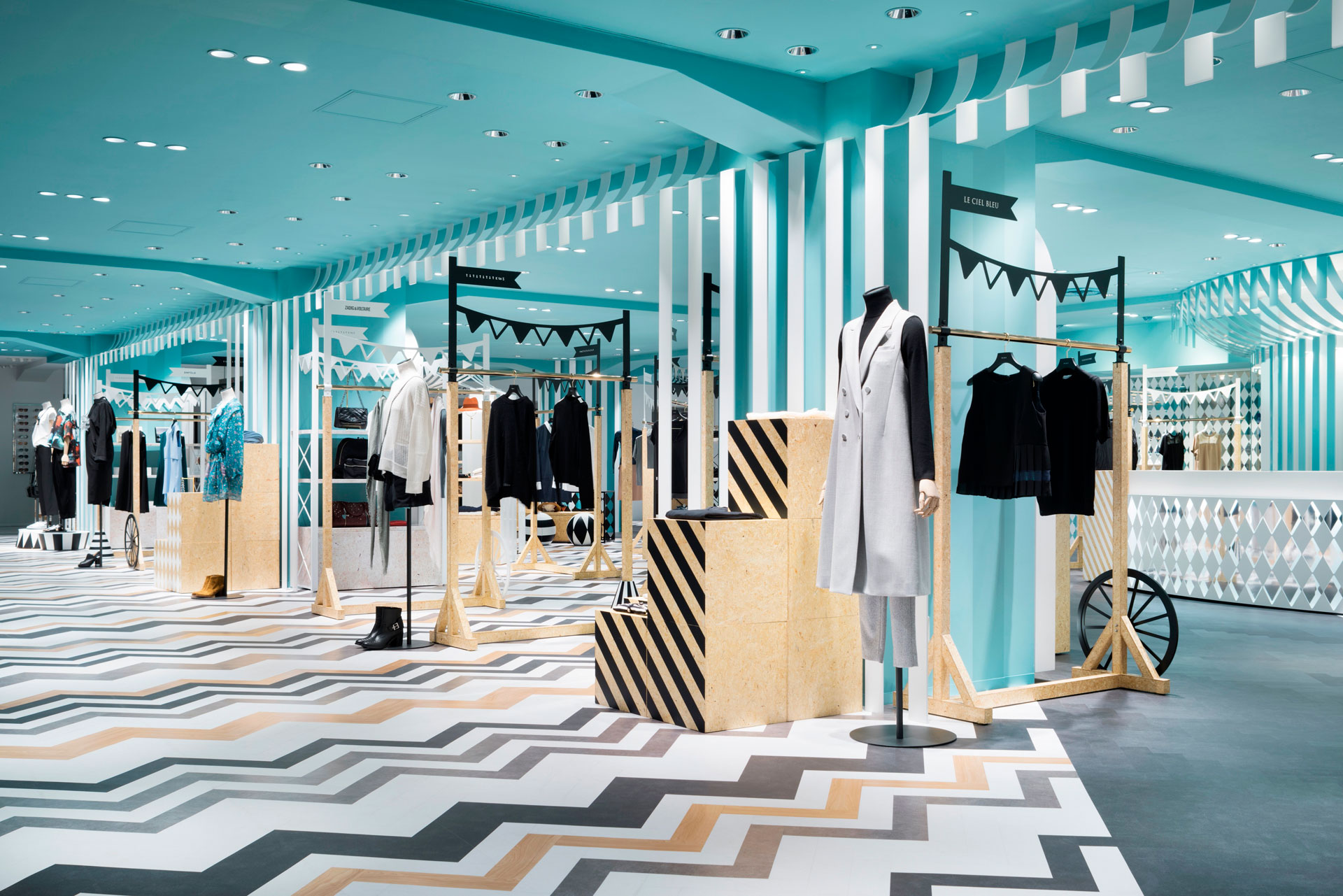
“风格的关键”是西武涩谷百货大楼主楼的女装时尚楼层。它通过步行道与我们在2013年设计的附属建筑三楼的“COMPOLUX”层相连,通过针对年轻客户的定位,它给人一种更休闲的感觉。
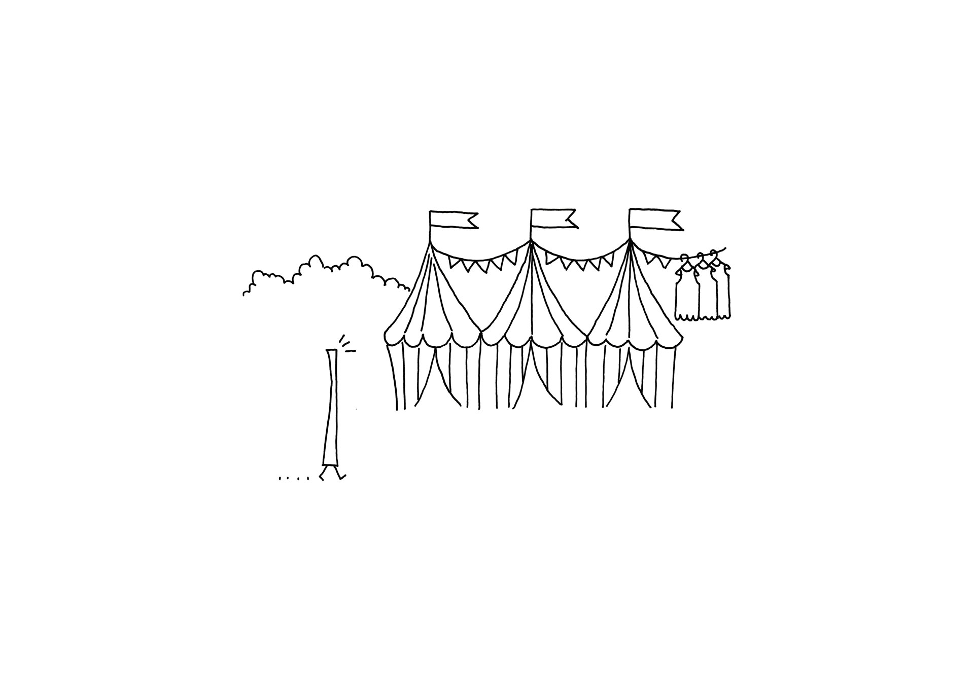
我们想创造一个动态的环境,同时保持与“COMPOLUX”区域的联系,该区域的灵感来自一个舒适的欧洲公园。因此,我们决定将在公园举办的“移动游乐园”作为设计主题。颜色是基于简洁的配色方案,而为了增加一些强调,天花板被涂成蓝色,一些部分使用了木材,这有助于增强颜色和产品的质感。销售区域的设计灵感来自一个马戏团帐篷,品牌的集合被营造成市场摊位的印象。附属地板的固定装置受到货车的启发。“COMPOLUX”的地板方案使用灰色塑料地砖,以人字形布局。
为了遵循这个方案,我们沿着连接附件建筑和主建筑的通道使用渐变效果,轻轻地改变了相同的颜色。在“风格的关键”区域,我们增强了带有条纹图案的塑料地砖颜色的对比。销售区域围绕着自动扶梯,扶梯周围形成了供人们步行的环形线路。
该区域增加了对角运行的十字形通道,以改善人流并创建一条视线。该项目不仅仅是设计一个空间,而是将西武涩谷百货商店作为一个整体来考虑,并扩展了COMPOLUX的概念。
“key to style” is the women’s fashion floor within the main building of the Seibu Shibuya department store. It is connected by a walk-way with the “COMPOLUX” floor on the third floor of the annex building that we designed in 2013, and has a more casual feel by targeting the young customer.
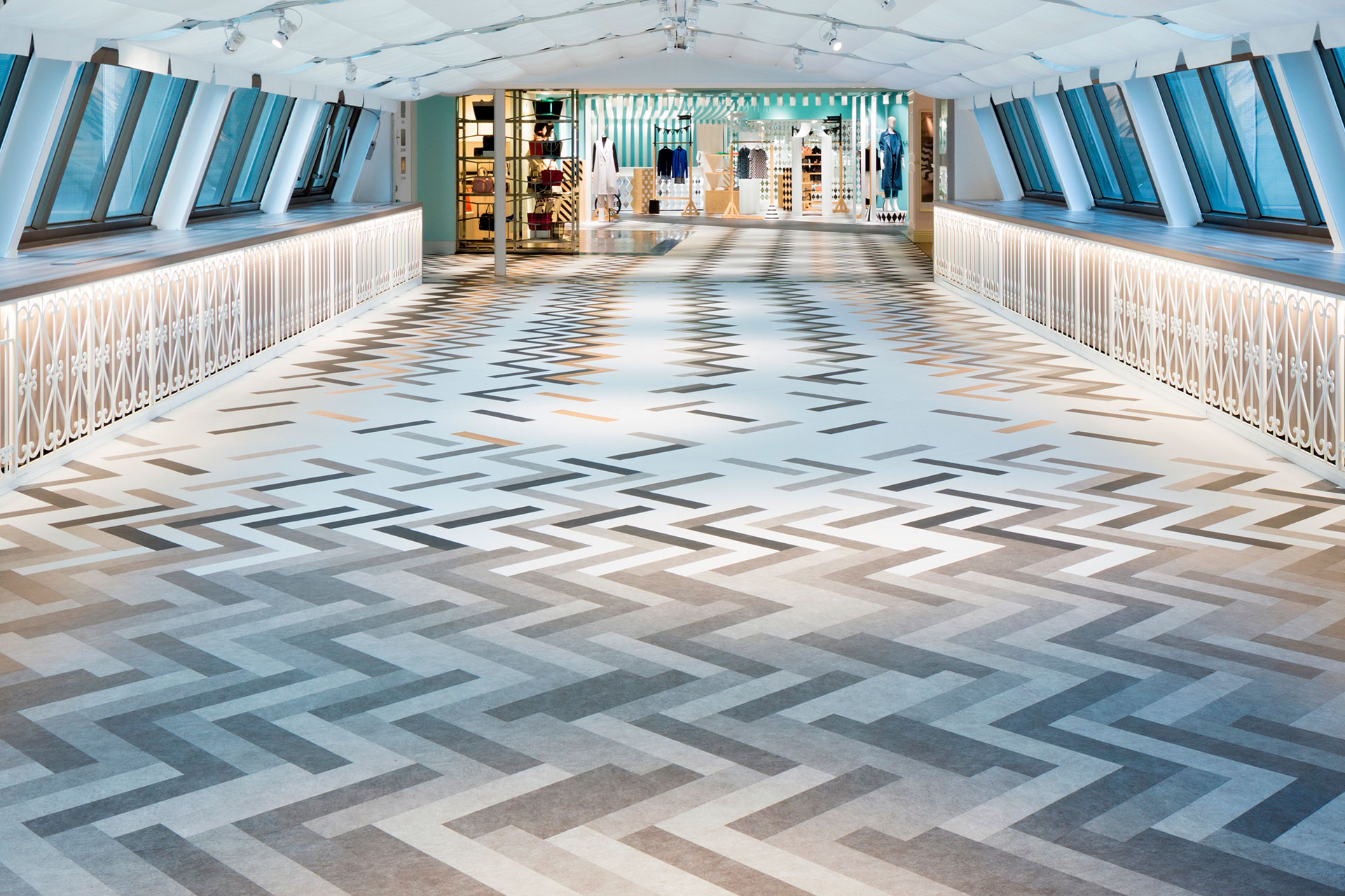
We wanted to create a dynamic setting while maintaining the connection with the “COMPOLUX” area that was inspired by a cozy European park. Hence, we decided on the “mobile amusement park” that is held at parks as the design theme. The colours are based on a monotone colour scheme, while to add some accent the ceiling was coloured blue and wood was used in some parts, .which helps to enhance the colour and the sense of texture of the products. The design of the sales area is inspired by a circus tent, and the collection of the brands are arranged to give the impression of market stalls. The fixtures of the accessory floor were inspired by wagons. The flooring scheme of the “COMPOLUX” uses grey plastic floor tiles that are laid out in a herringbone style.
To follow this scheme, we made the same colour change gently using the gradation effect along the passage that connects the annex bldg. and the main bldg.. In the “key to style” area we enhanced the contrast of the colours of the plastic floor tiles incorporating striped patterns. The sales area surrounds the escalator, around which a circular line is formed for people to walk through.
Cross shaped passages that run diagonally were added to this area in order to improve the flow of people and create a line of sight. The project became one of, not simply designing a space, but to think of the Seibu Shibuya department store as a whole and to expand the concept of COMPOLUX.

Design: Nendo
Photography: Takumi Ota
Year: 2016
Status: Completed works
Type: Shopping Malls / Showrooms/Shops