
用店主的话说,”纳纳克商店 “的诞生是为了支持一种坐在三脚架上的生活方式:快乐、健康和圣洁。灵感来自于古鲁-纳纳克-德夫的名字,他是锡克教修行者中的参考。该商店提供各种家用产品和有机、素食和无麸质食品,围绕着一个小型咖啡馆空间。
In the words of the owners, the Emporium Nanak born of a desire to support a lifestyle seated on the tripod: happy, healthy and holy. The inspiration comes from the name of Guru Nanak Dev, reference among practitioners of Sikhism. The emporium offers a variety of products for home and organic, vegan and gluten-free foods, around a small chai-café space.

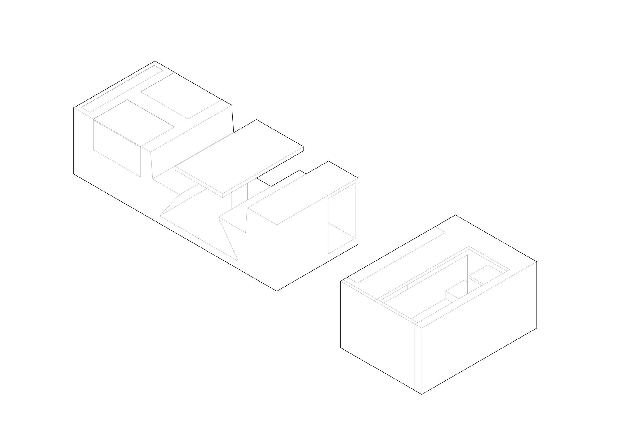
曝光和隐蔽
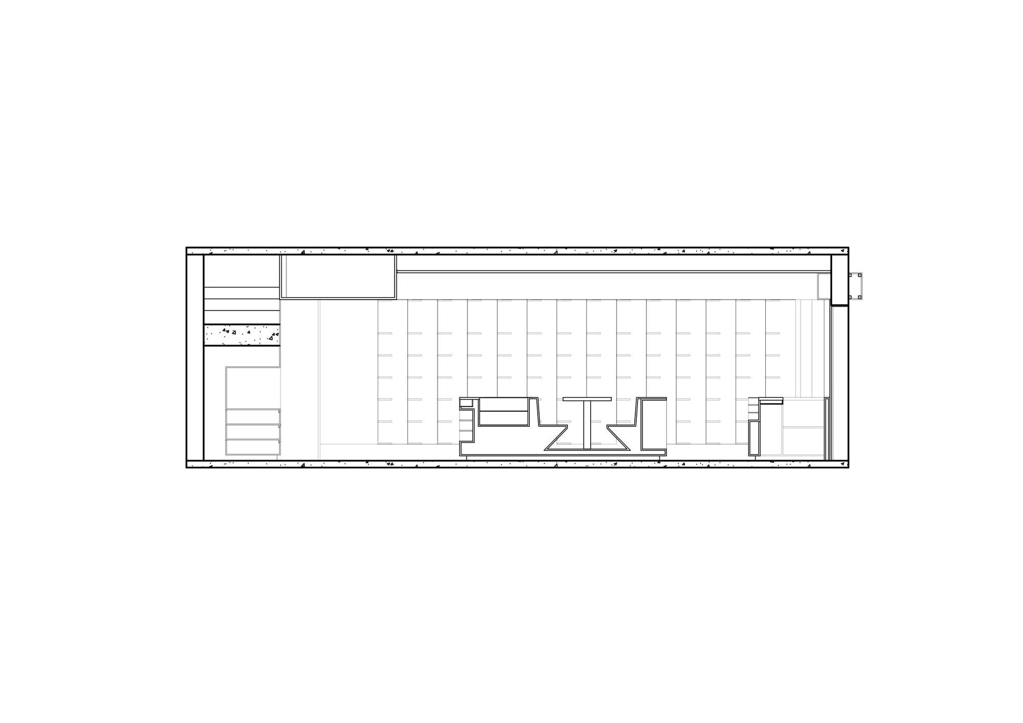
该项目采用了一种将产品的暴露和隐蔽相结合的策略。一个固定的网格与两面墙的关系是斜的,允许进入的人完全看到产品,并考虑到其隐藏在里面的情况。这一特点保证了一定的宁静和安静,使那些想在中间的桌子上喝茶的人更喜欢这个空间,同时又不失典型的商场的复数氛围。
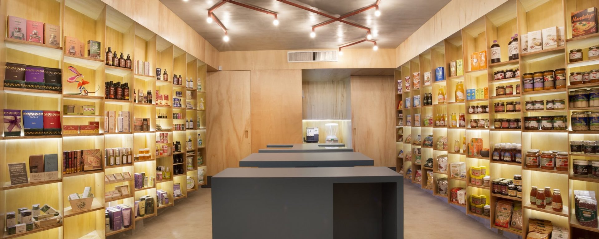
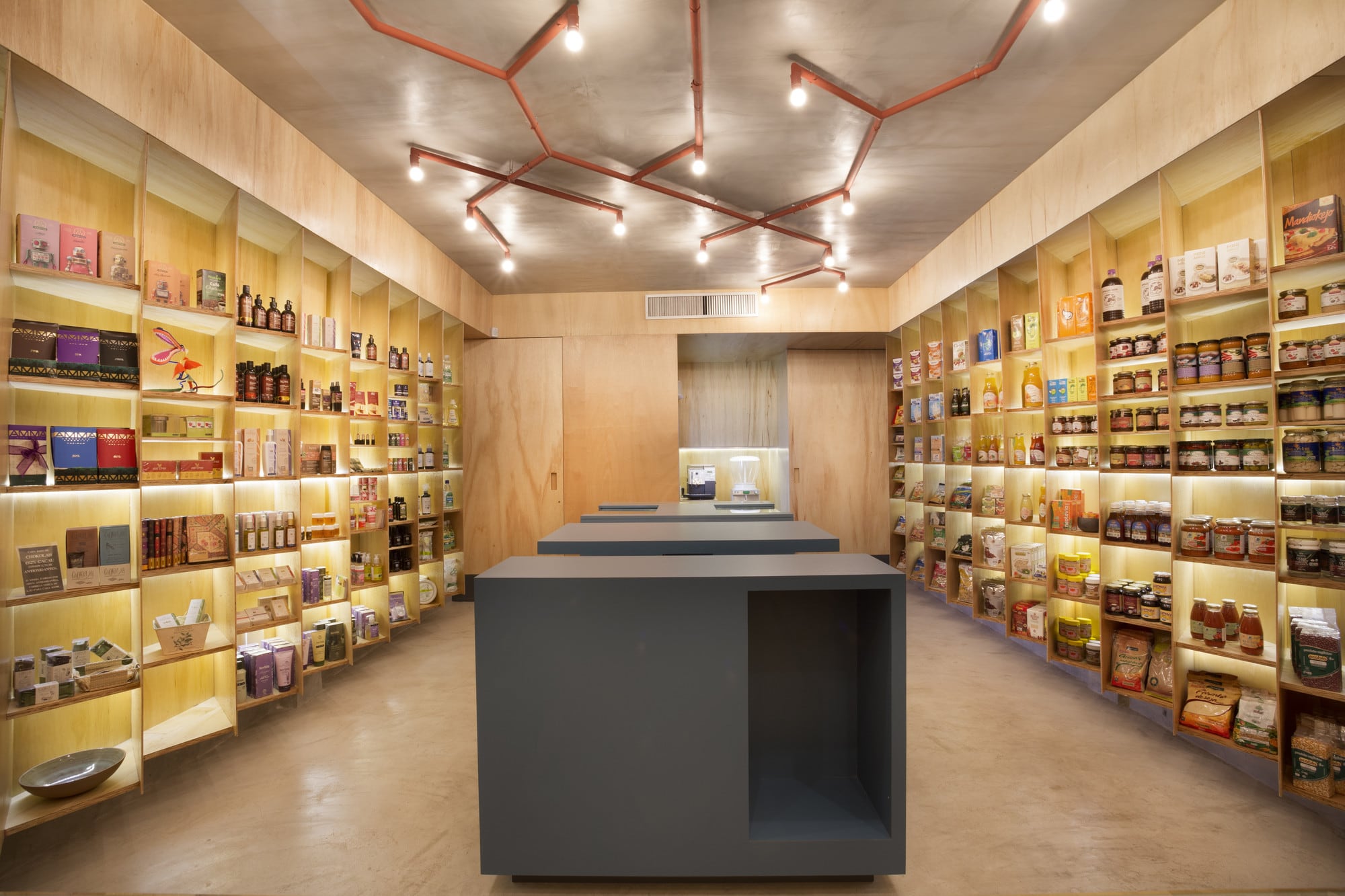
Exposure and Concealment
The project adopts a strategy that combines exposure and concealment of the products. A fixed grid oblique in relation to the two side walls permits full vision of the products for the incoming people, and in view of its concealment inside out. This feature guarantees a certain tranquility and silence, making the space more enjoyable for those who want to have a tea in the center table, without losing the typical plural ambience of the emporiums.
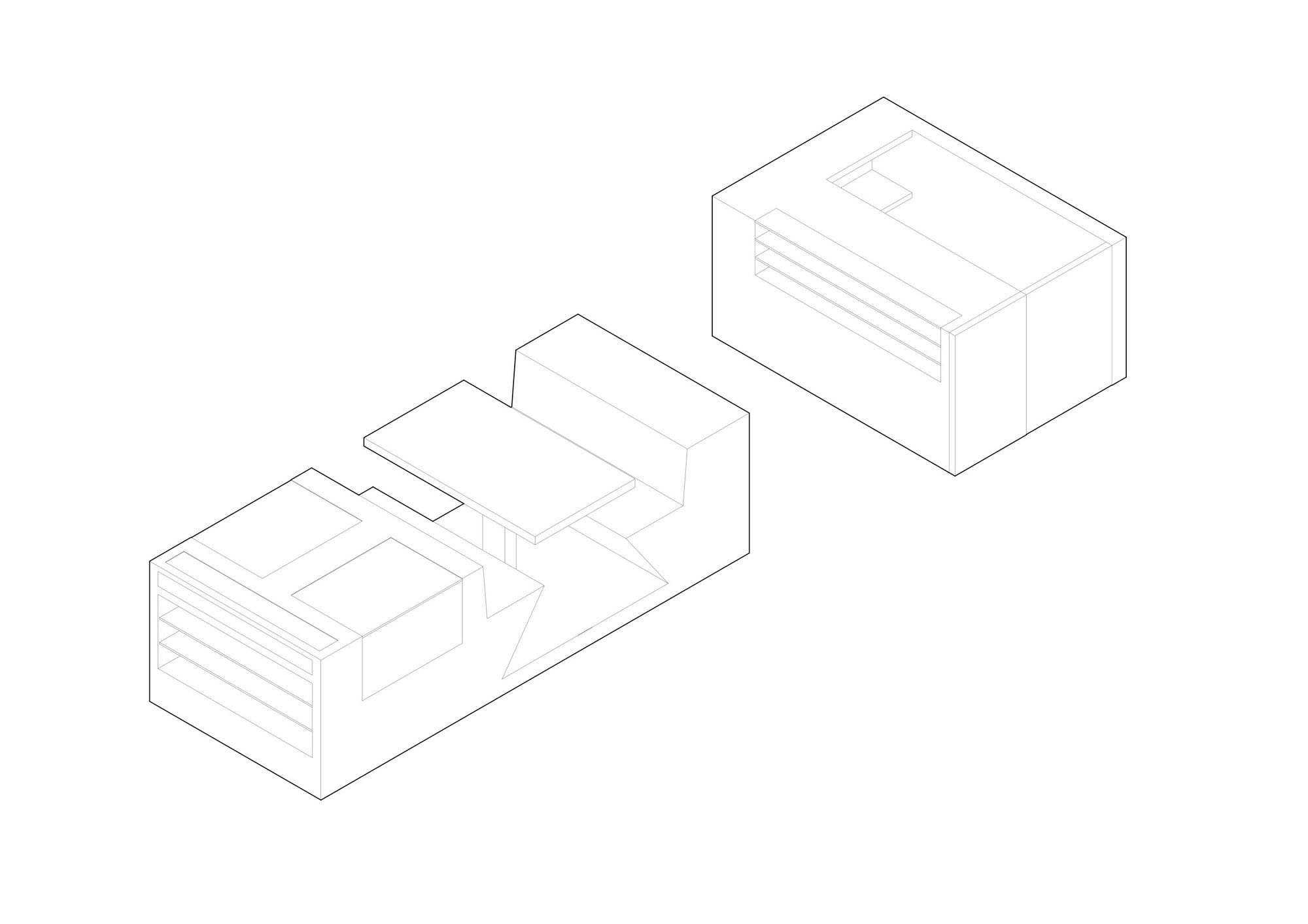
统一性和多样性
展览采用了网格,作为图形设计中用于组织页面中的完整和空隙的类似特征。它的结构允许使用的灵活性和适应性,通过添加水平支持来细分模块。这个解决方案为在尺寸、形状和颜色上如此不同的产品提供了统一性。
Unity and Diversity
The exhibition adopts a grid as a similar feature used in the graphic design for the organization full and empty spaces in a page. It’s structure allows flexibility of use and adaptability, by adding horizontal supports subdividing the modules. This solution provides unity to products so diverse in size, shape and color.
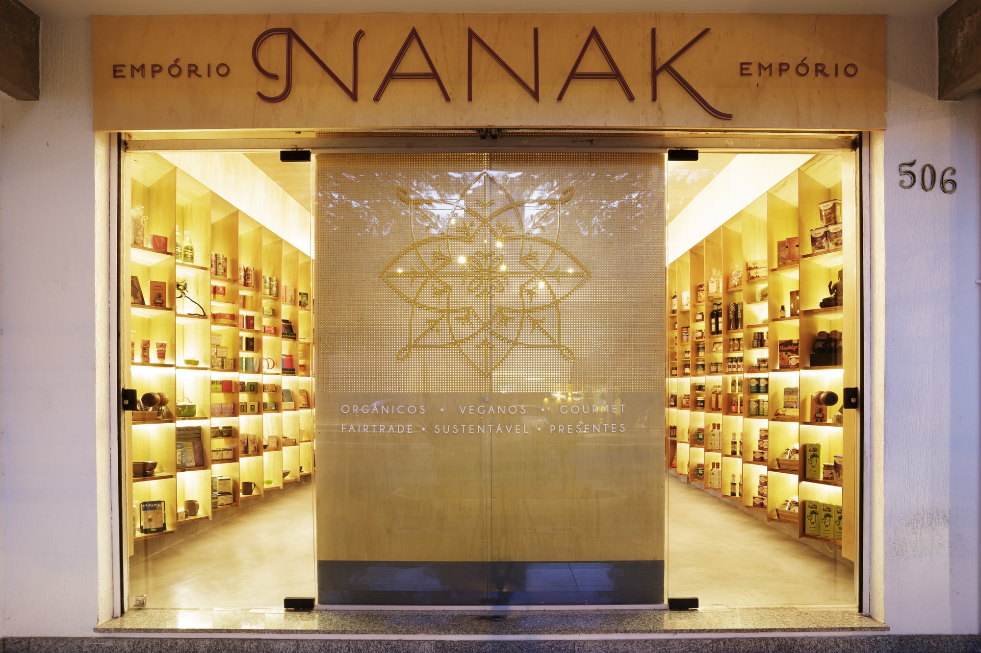
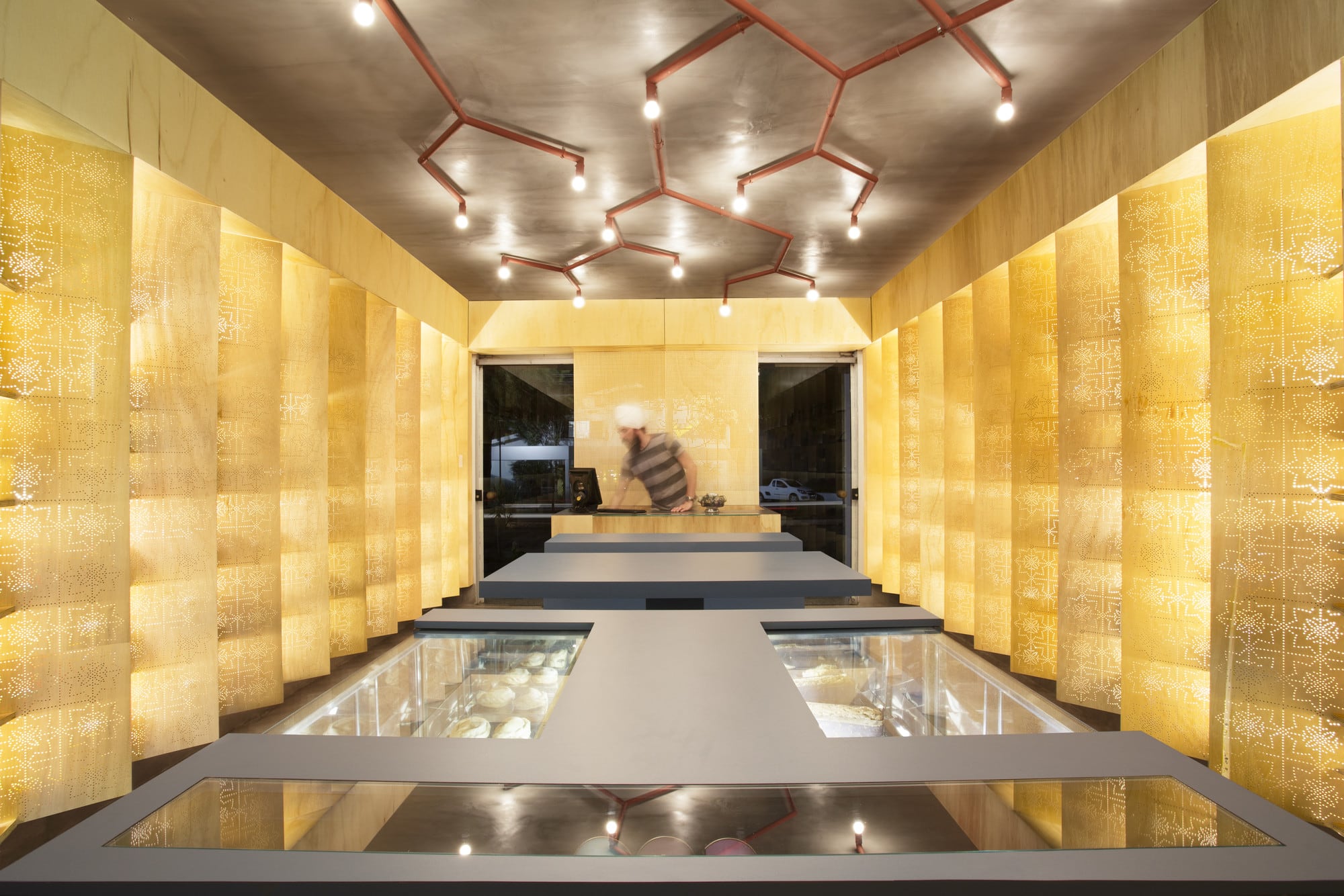
符号参考
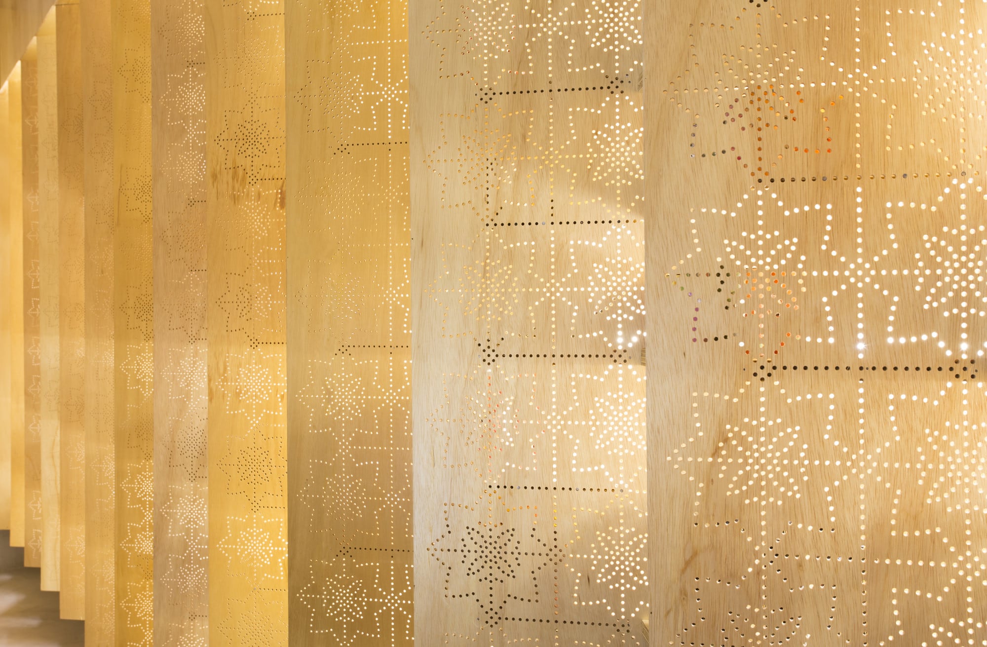
在通道钻孔中使用的标准是从Nanak Emporium的标志中提取的,而这个标志又参考了Amritsar的金庙,这是一个锡克教的圣地,也是该商场所有者的宗教。
Symbolic reference
The standards used in the drilling of the pannels were extracted from Nanak Emporium’s logo, which is in turn referenced in the iconography present at the Golden Temple in Amritsar, a shrine of Sikhism, which is the religion of the owners of the emporium.

材料和颜色
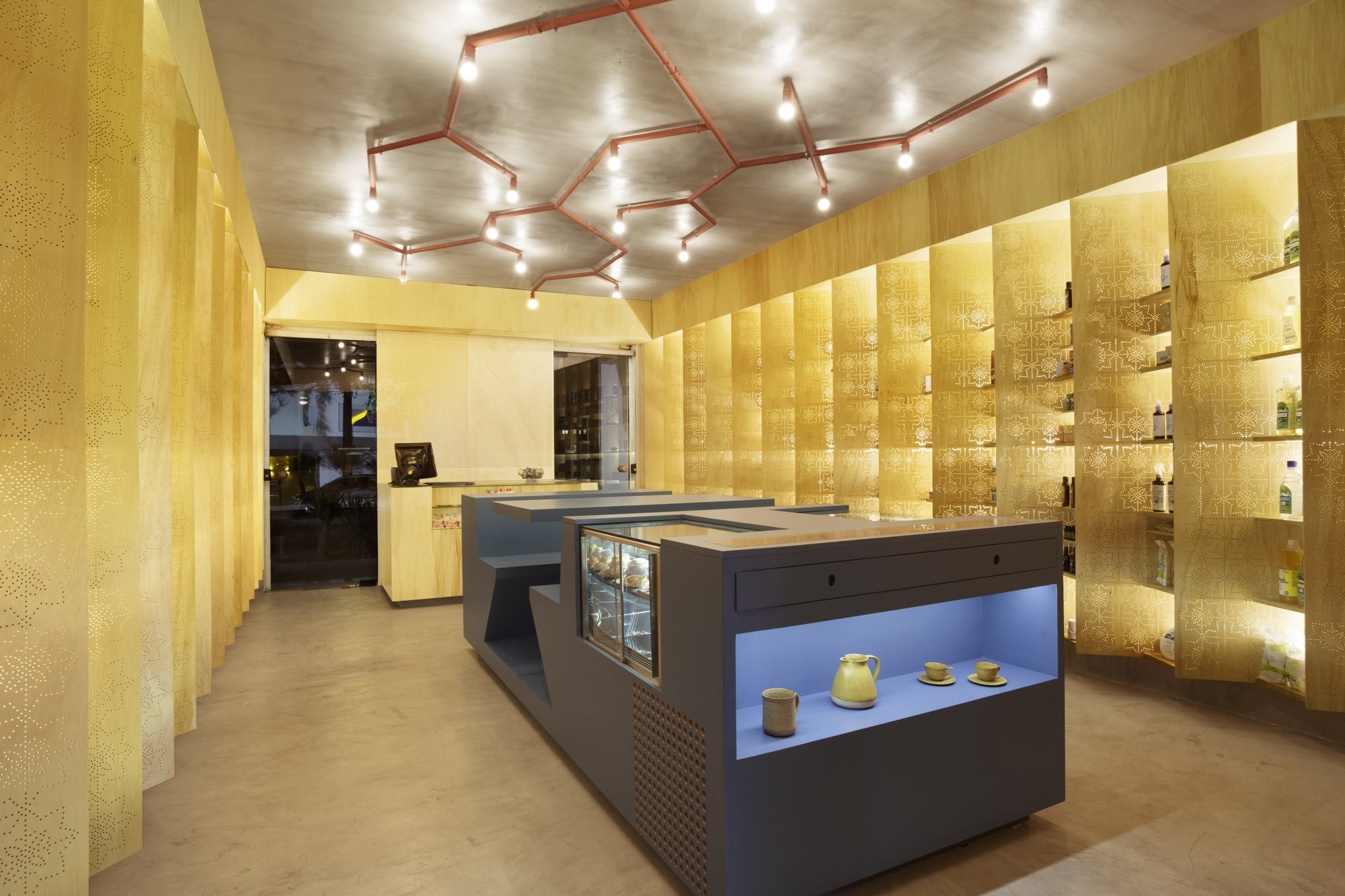
原材料是优先考虑的:混凝土地板和天花板以及货架、门和墙的木板。淡黄色的木材呈现出金色的光芒,并作为所有产品的共同背景。
Materials and Colors
Raw materials are prioritized: concrete floor and ceiling and wood paneling on shelves, doors and walls. The yellowish wood takes on a golden glow, and acts as a background common to all products.
照明
一个简单的LED系统突出了墙壁,有助于产品的可视化。一般的照明是由一个带有灯泡的金属管提供的,强度可控。
Lighting
A simple system of LED highlights the walls, contributing to product visualization. General lighting is provided by an installation with metal tubes with light bulbs, with controlled intensity.
空间组织
在商场的中心,有一个多功能的结构,可以容纳购物篮,最多六个人的咖啡桌,以及产品和设备的空间。这样的安排使参观者能够流畅地移动。
Spatial organization
In the center of the emporium, lies a multifunctional structure to accommodate the shopping baskets, up to six people in the chai-café table, plus spaces for products and equipments. The arrangement allows the fluid movement of the visitors.

Architects: MACh Arquitetos
Area : 40 m²
Year : 2012
Photographs :Gabriel Castro / Reverbo
Construction : Armtec
Architects In Charge : Fernando Maculan, Mariza Machado Coelho
Associated Architect : MOBIO ARQUITETURA, Gabriel Castro
Wood : Marcenaria Londrina
City : Belo Horizonte
Country : Brazil