

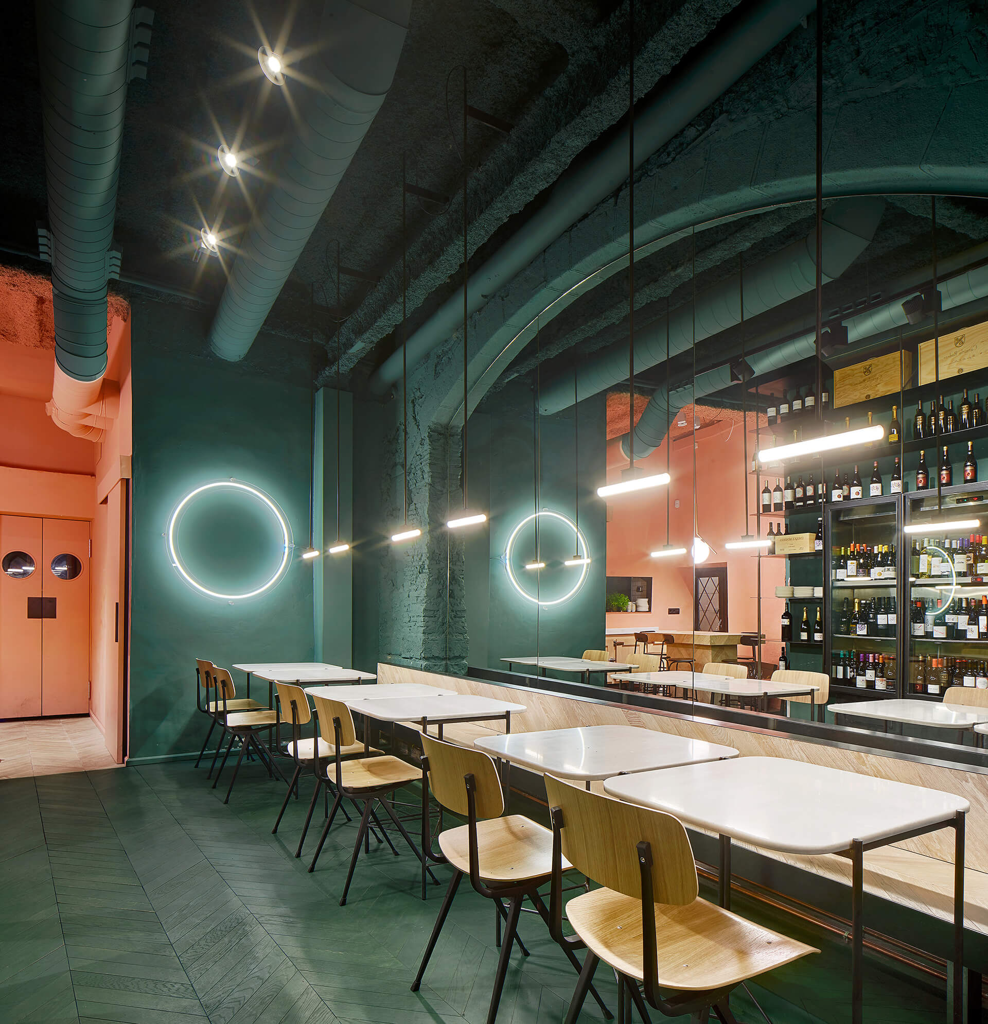
当Isern Serra和Sylvain Carlet开始设计Orvay,他们有一个简单的使命:创造一个品尝葡萄酒的地方,一个可以激活沉浸式环境的地方,可以成为葡萄酒类型学的隐喻。三个颜色区域定义了酒吧:一种用来指代葡萄酒地理的泥土色调,用于引领葡萄园想象力的绿色色调,以及用于唤起葡萄图像的葡萄酒。Serra和Carlet希望创造一个反映葡萄酒本身的诚实,精致的环境:取出天花,他们决定将建筑物的结构露出,中世纪的墙壁和拱门等等。天然橡木地板和白色大理石没有使用过多色彩,但使颜色更有意义。
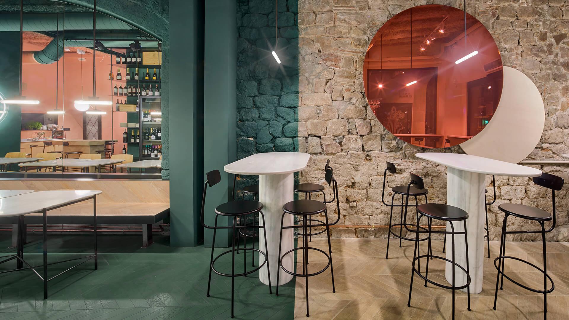
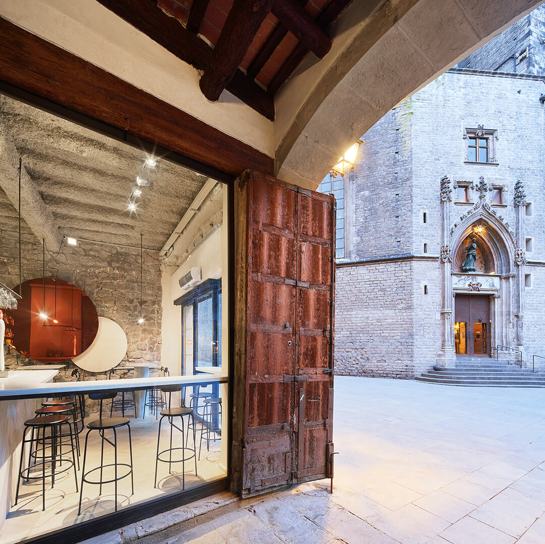
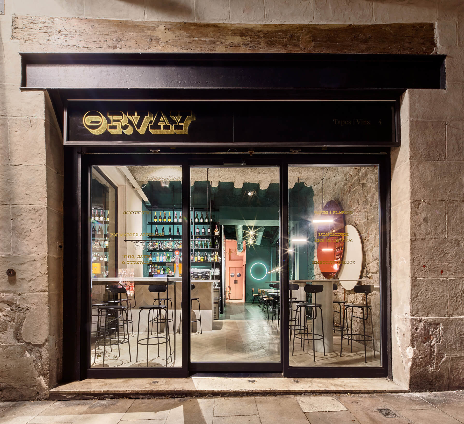
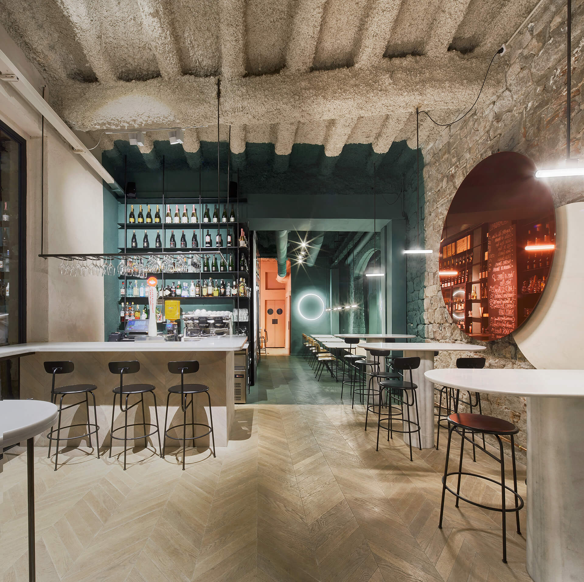
Isern Serra and Sylvain Carlet began designing Orvay, they had a simple mission: create a place to taste wines, one where the space could activate an immersive setting that could become a metaphor to the typology of wines offered. Three colour zones define the bar: an earth tone to refer to the geography of the wine, a green one to lead the imagination to the vineyards, and pink to evoke images of the grape – the crux of the wine’s personality. Serra and Carlet wanted to create an honest, sophisticated environment reflective of the wine itself: false ceilings were taken out and they decided that they would leave the structure of the building uncovered, medieval walls and arches and all. Natural oak wood floors and white marble pause chromatics, but make the colour even more meaningful.
Design: Isern Serra&Sylvain Carlet