
项目是将一栋两层楼的老房子改造成一所专门从事艺术教育的幼儿园。这座房子是所谓的西方风格,在1970年代的韩国很流行;半层楼房从道路上抬起来,尽量向后退,有一个宽阔的朝南的前院。
Project was to transform an old two-story house into a nursery school specialized in art education. The house was so called Western Style which prevailed in 1970’s in Korea; half-story raised ground from the road, set back as far as possible with a broad south facing front yard.
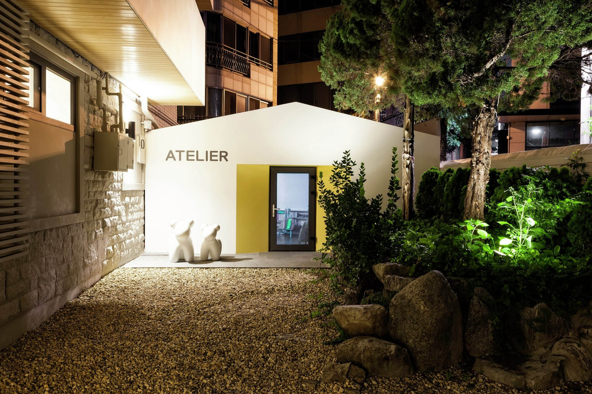
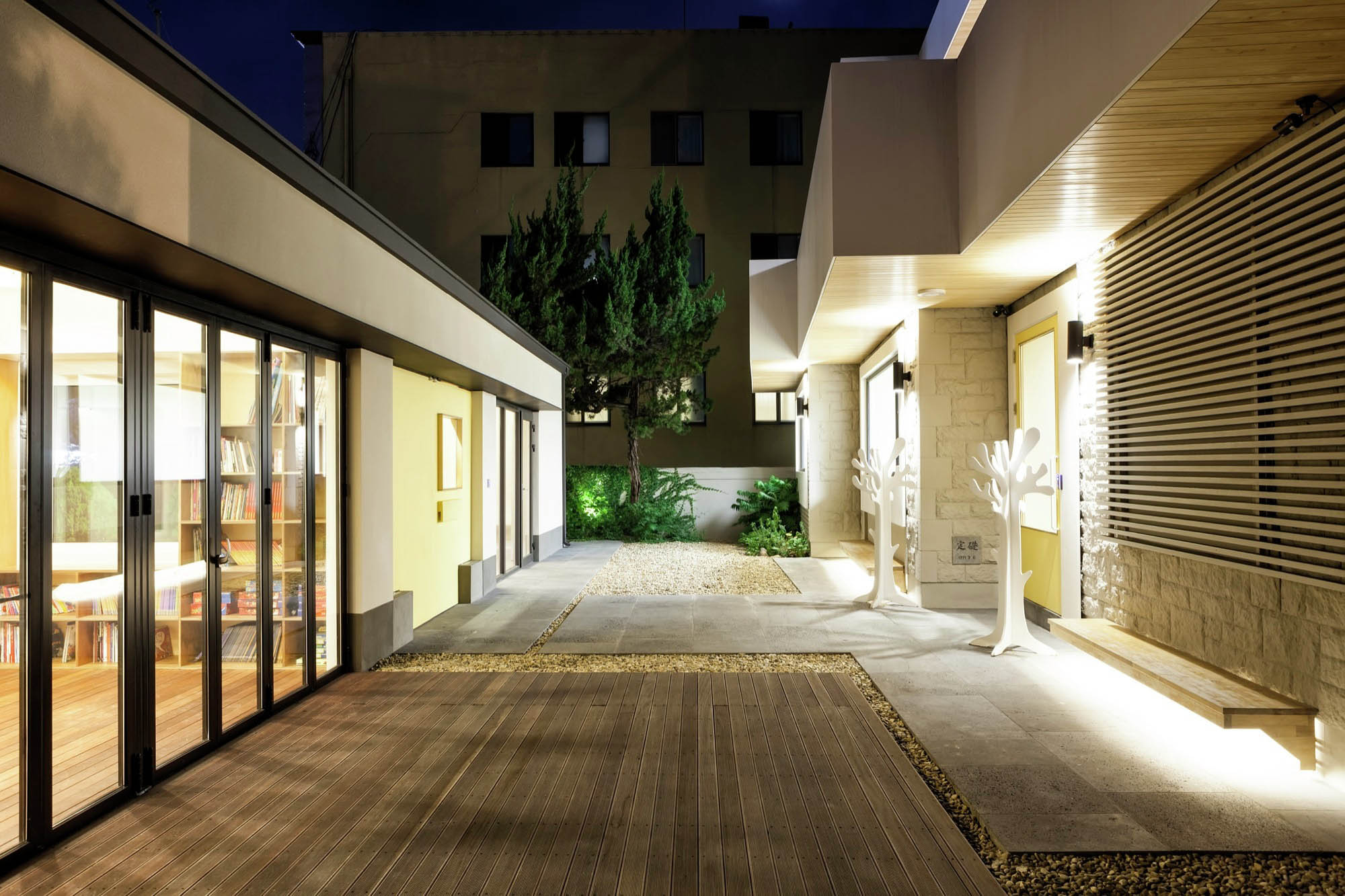
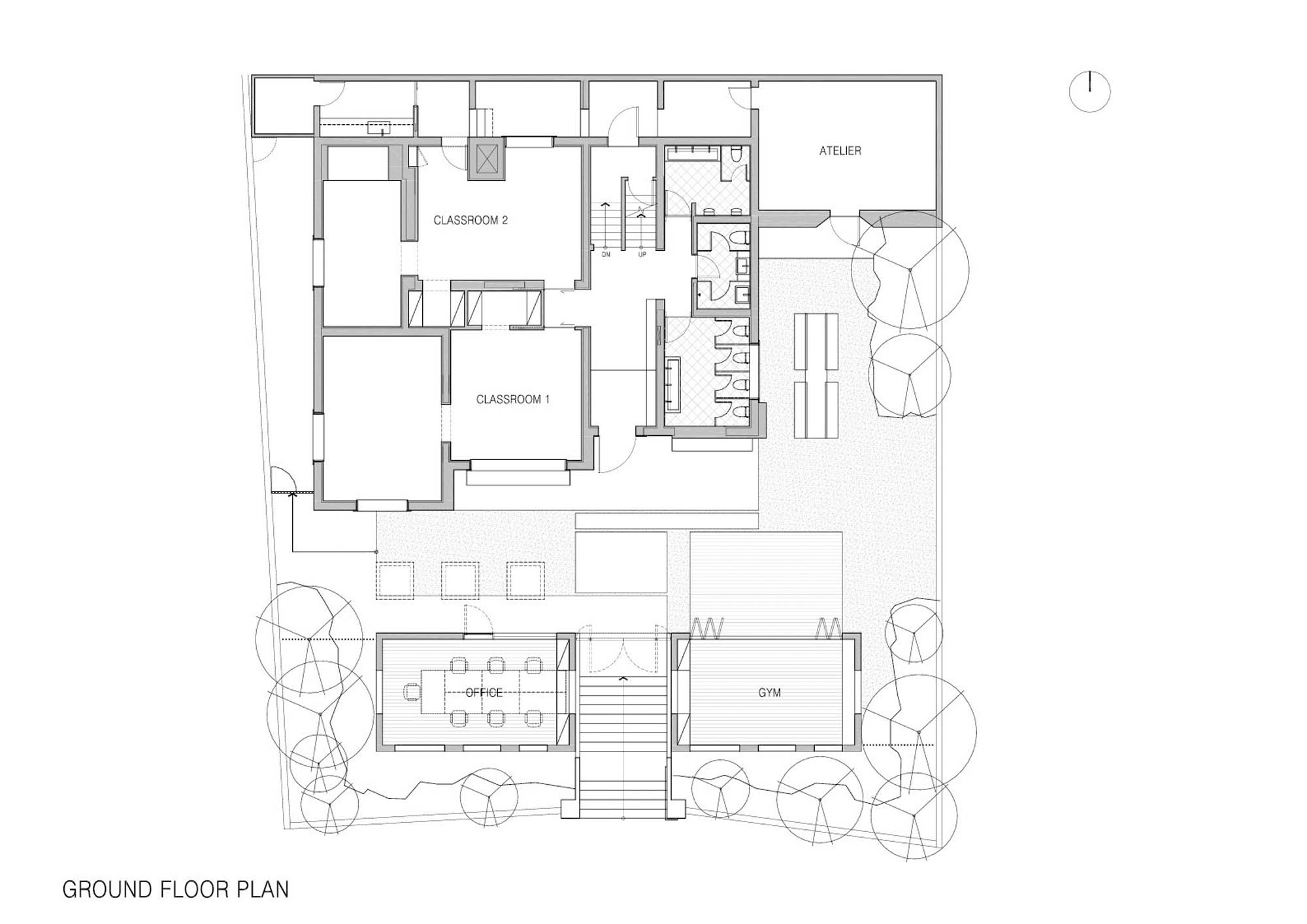
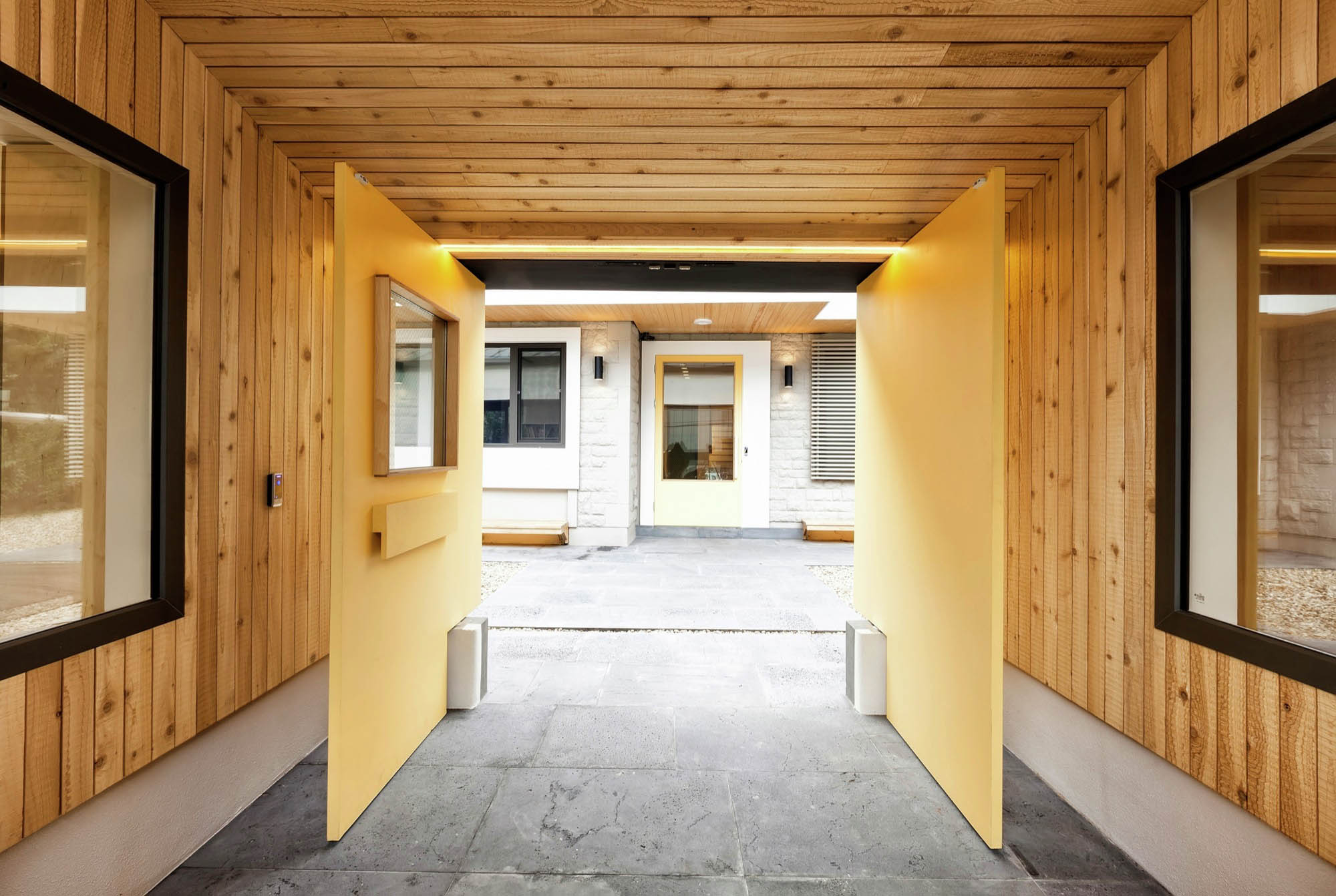
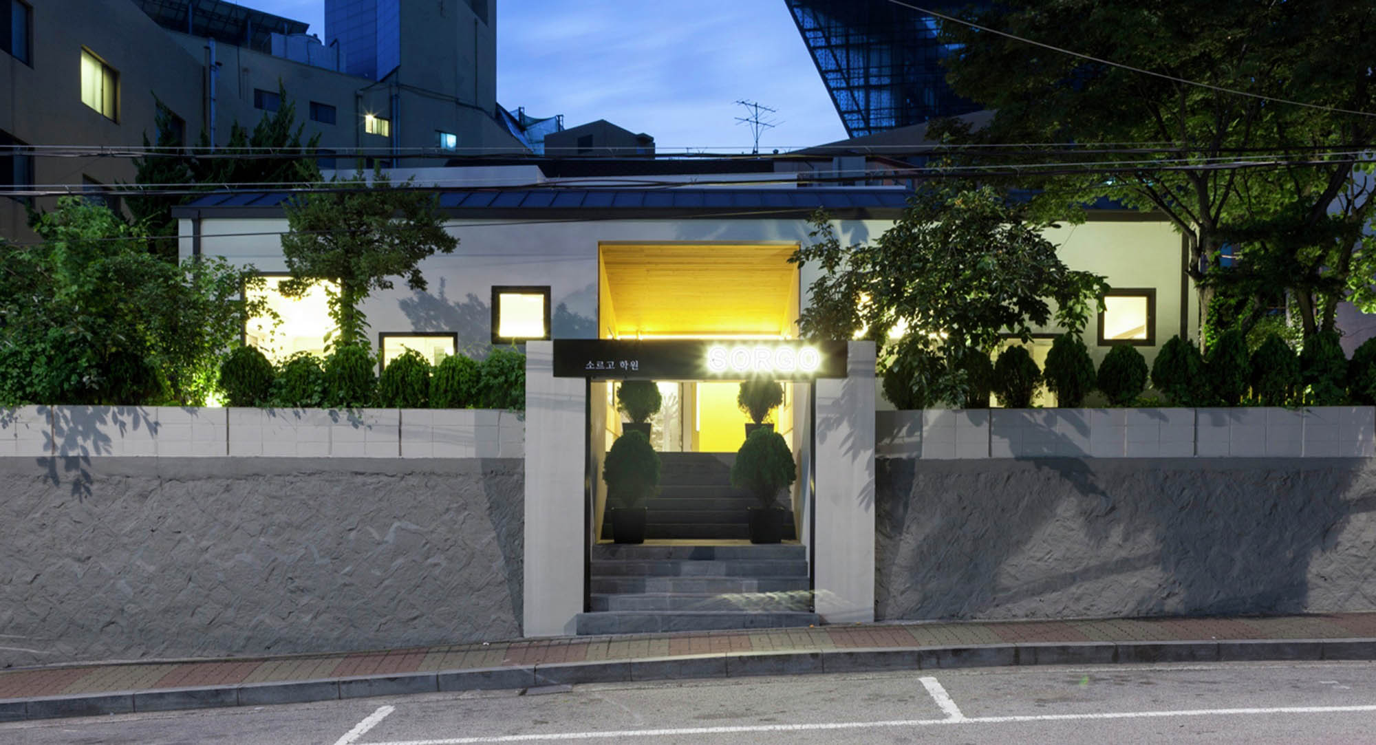
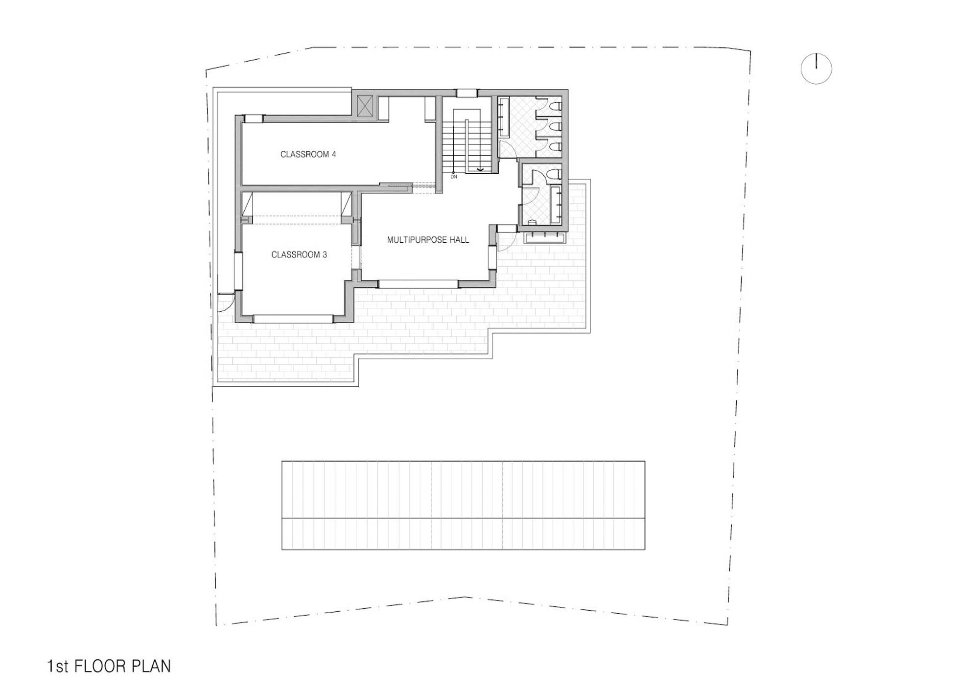
为了满足计划,还增加了一个附属建筑。它是沿着主干道设置在高地上的。通过这样做,可以保证儿童在道路上的空间,并利用附属建筑和主楼之间的空间。入口的设计给人更多的感觉–进入儿童的领地。教师办公室和体育馆被对称地放在入口处。它们的窗户被规划在一条轴线上,这样教师可以很容易地监督周围的孩子,也可以从入口处监督访客。
An annex was added to meet program. It was set along the main road on the raised ground. By doing so, it was possible to secure children space from the road, and to utilize space between the annex and main building. Entrance was designed to give more sense of arriving – into a children’s territory. Teachers’ office and a gymnasium were located by the entrance symmetrically. They are planed with windows on a single axis, so that teachers can easily supervise children all around and visitors from the entrance as well.
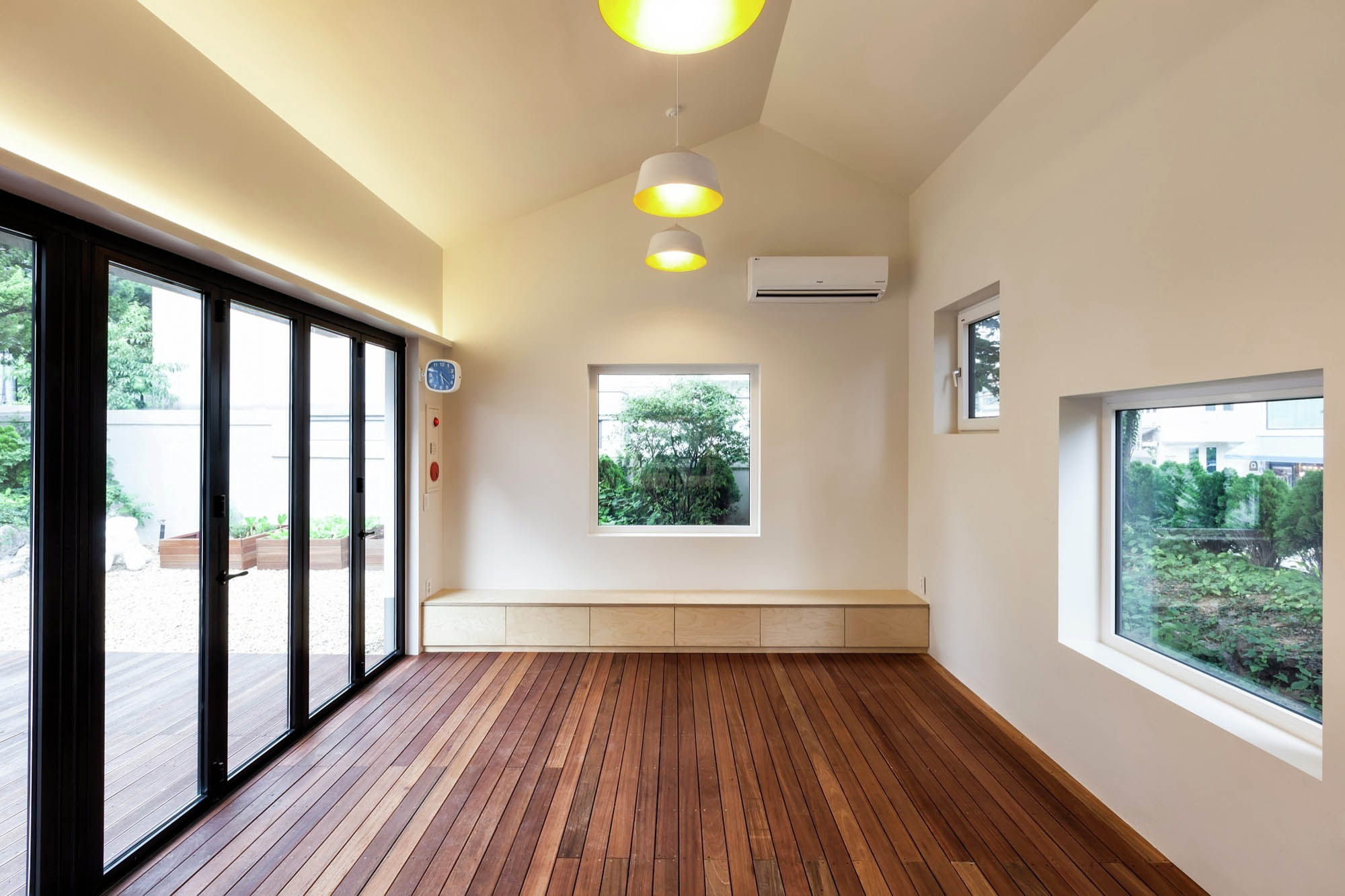
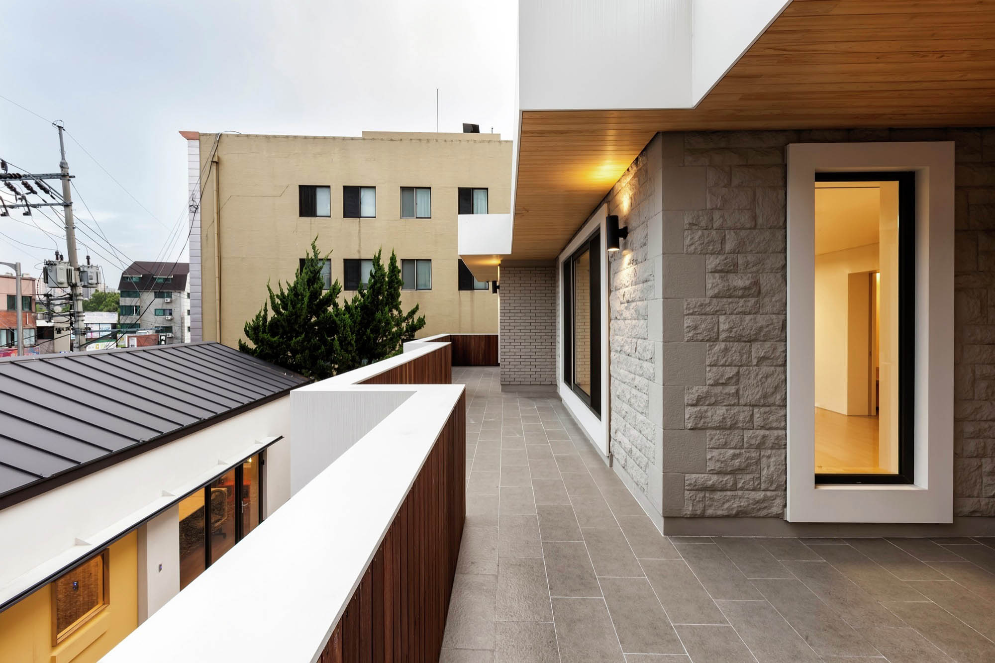
关于主楼,重要的是要决定哪些是要保留的,哪些是要从1970年代开始删除的。由于快速增长,对大多数韩国人来说,”1970 “不仅意味着 “过时”,而且意味着 “低于标准”。沿着 “之 “字形运行的平台,有古典形状的混凝土扶手–这是最强的元素。人字形的形状被认为是积极的,所以它们被金属板覆盖并涂成白色,这样简单的折叠平面就可以拥抱院子了。此外,主楼外墙的石头纹理被保留下来,但涂成浅灰色,使院子成为一个生动的儿童空间。此外,体育馆被设计成可开放的,以便室外空间可以与室内空间融合。
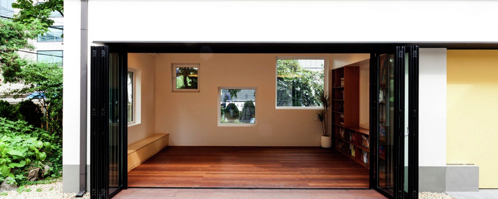
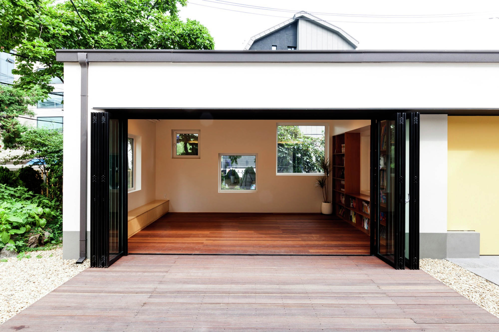
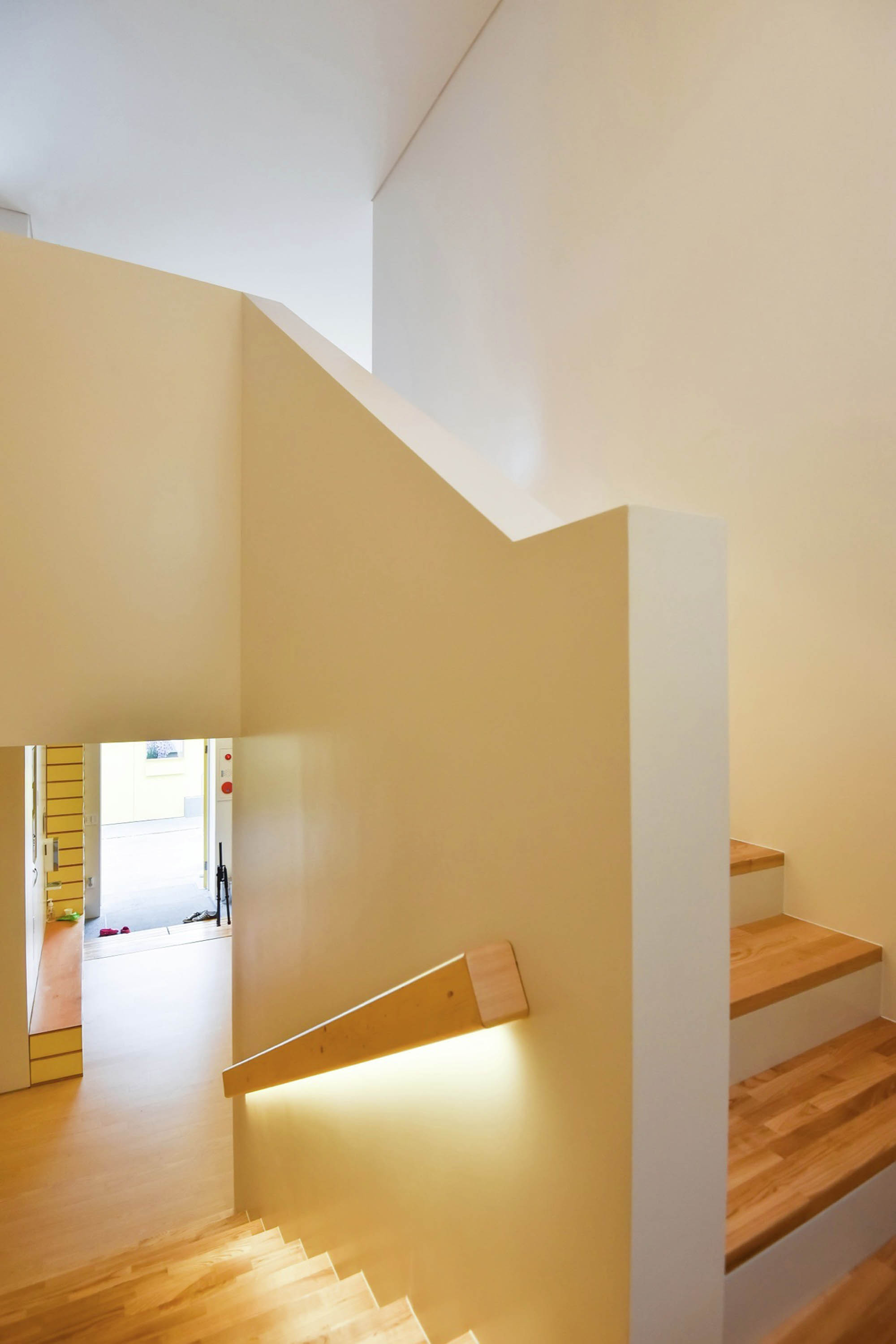
Regarding the main building, it was important to decide what to keep and what to erase from the 1970’s. Because of rapid growth, to most Koreans’ 1970’ means not only ‘out of date’ but also ‘below standard’. There were classical shaped concrete handrails along zig-zag running terrace – strongest element. Shape of zig-zag was regarded positive, so they were covered by metal sheet and painted white, so that simple folded planes can embrace the yard. In addition, stone texture of the main building’s façade was kept, but painted light grey to turn the yard into a lively space for children. Plus, gymnasium was designed openable so that outdoor space can merge into interior.

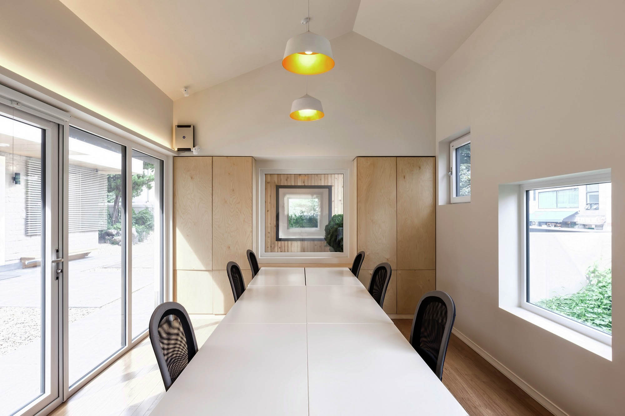
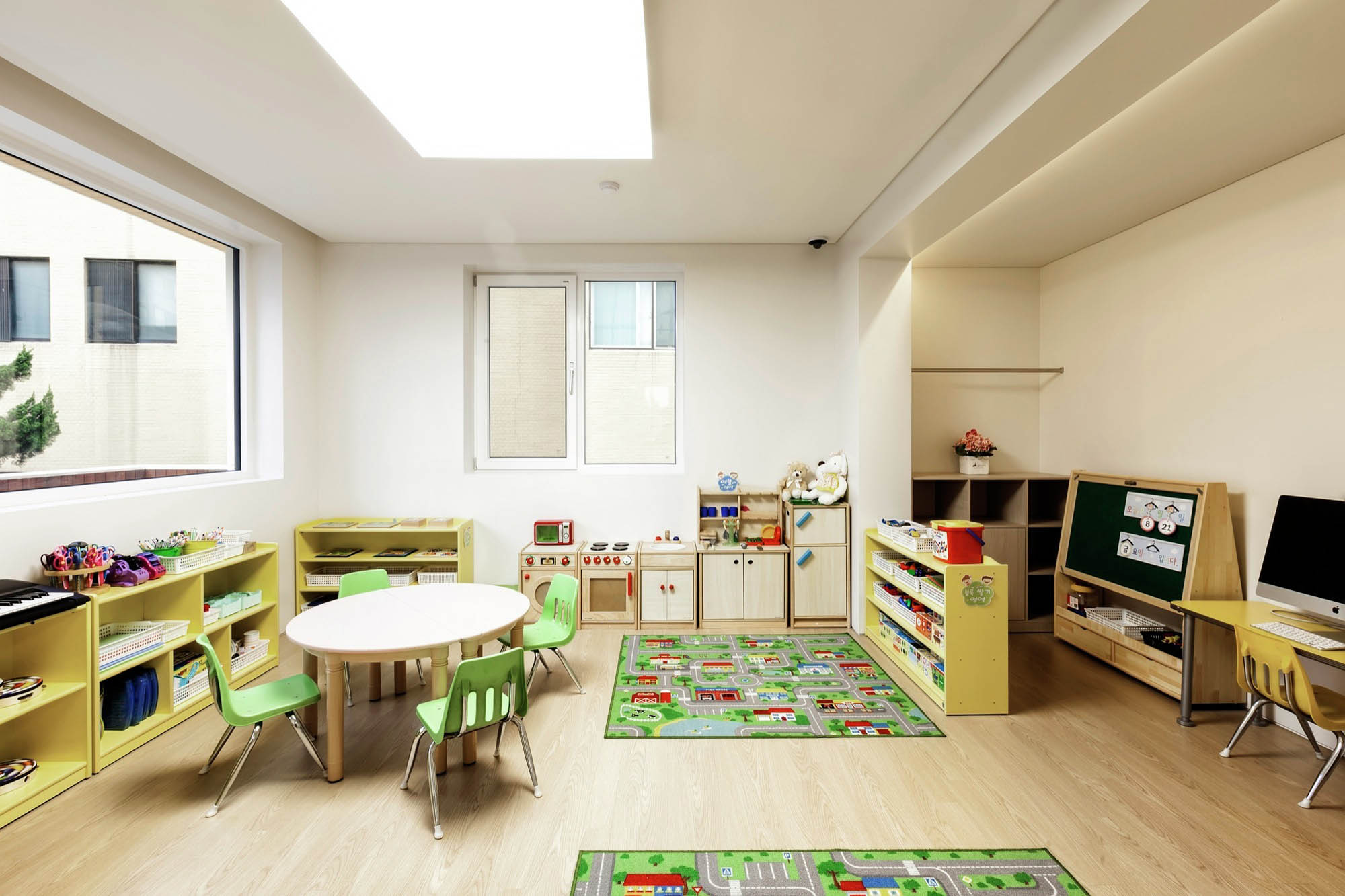
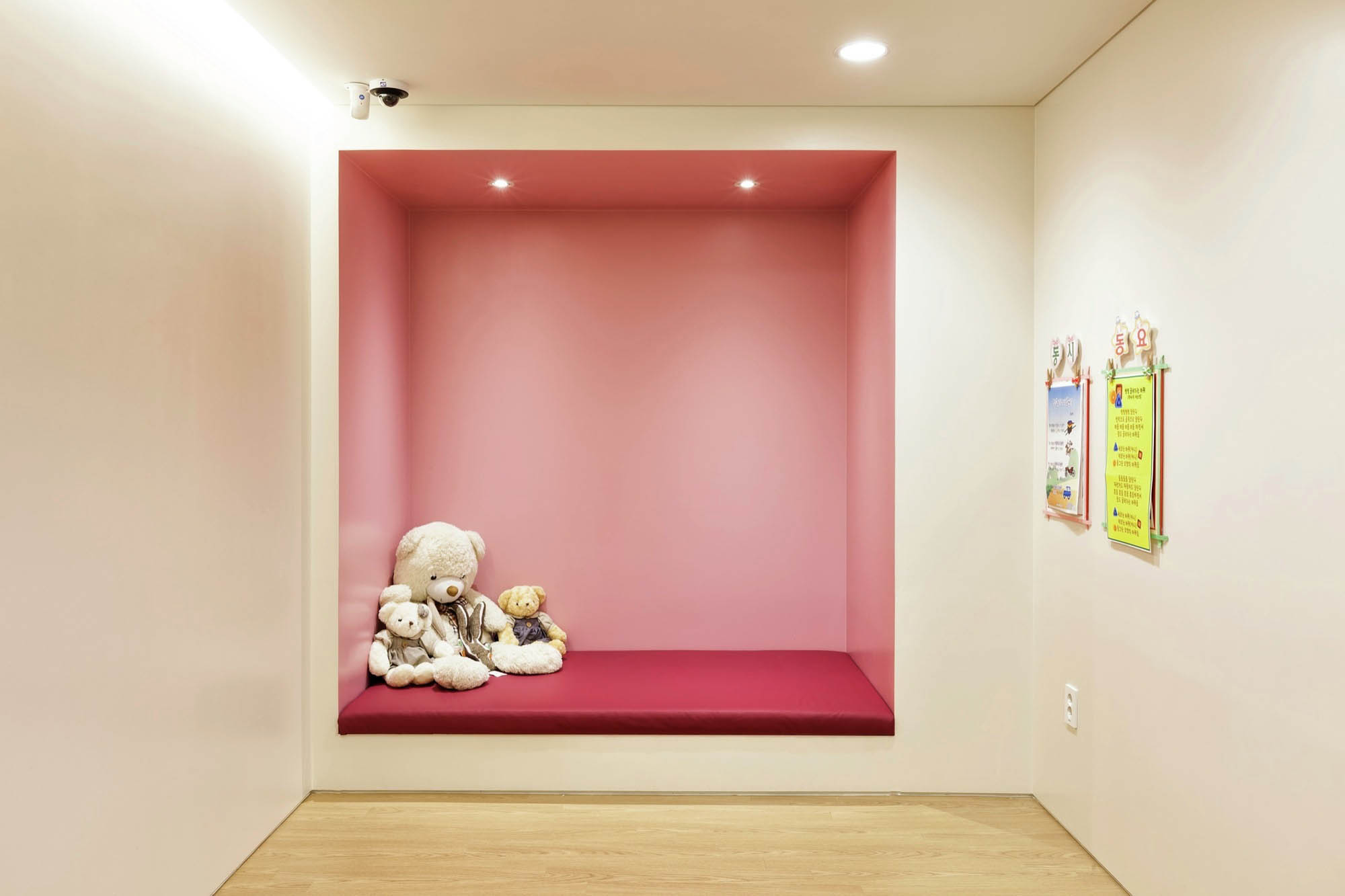
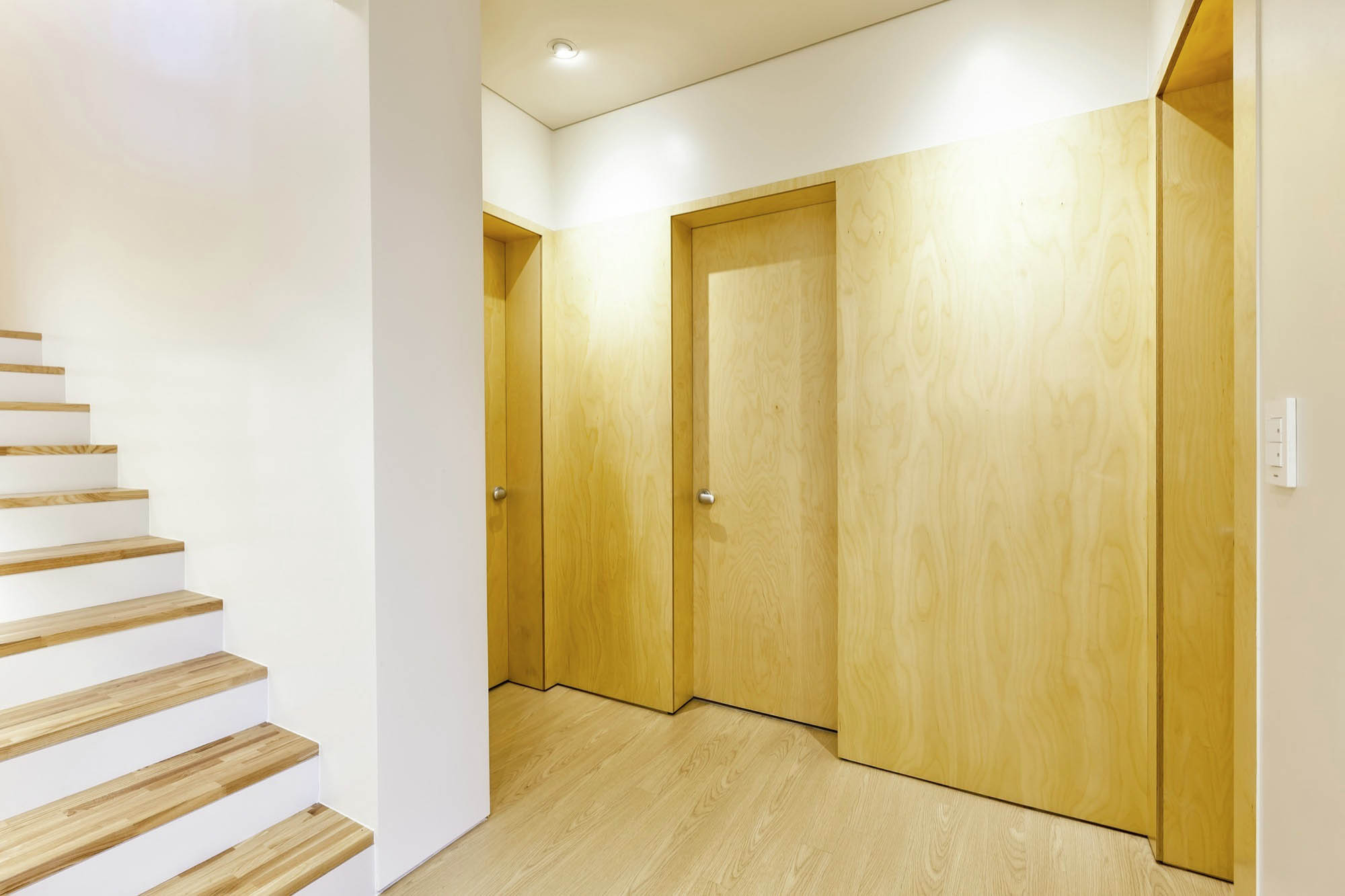
室内的总体概念是 “帆布”。通常情况下,儿童空间不可避免地伴随着大量的彩色家具和玩具。重点是创造环境,给予健康的刺激,而不是即时的刺激。孩子们会在光线充足的空间里成长出平衡的审美感。
General concept of interior was ‘Canvas’. Normally, children spaces inevitably accompany a lot of colorful furniture and toys. Focus was on creating environment to give healthy stimulations rather than instant ones. Children will grow balanced sense of aesthetic while getting around well-lit spaces.


Architects: design studio in tu:ne
Area: 330 m²
Year: 2015
photographs: Yongkyu Lee
Construction: MD design
Collaborator:Hyungin Rym
Design Team:Hyungsuk Kang, Seoungkyung Shin
City:Seoul
Country:South Korea